
Product search
Select language
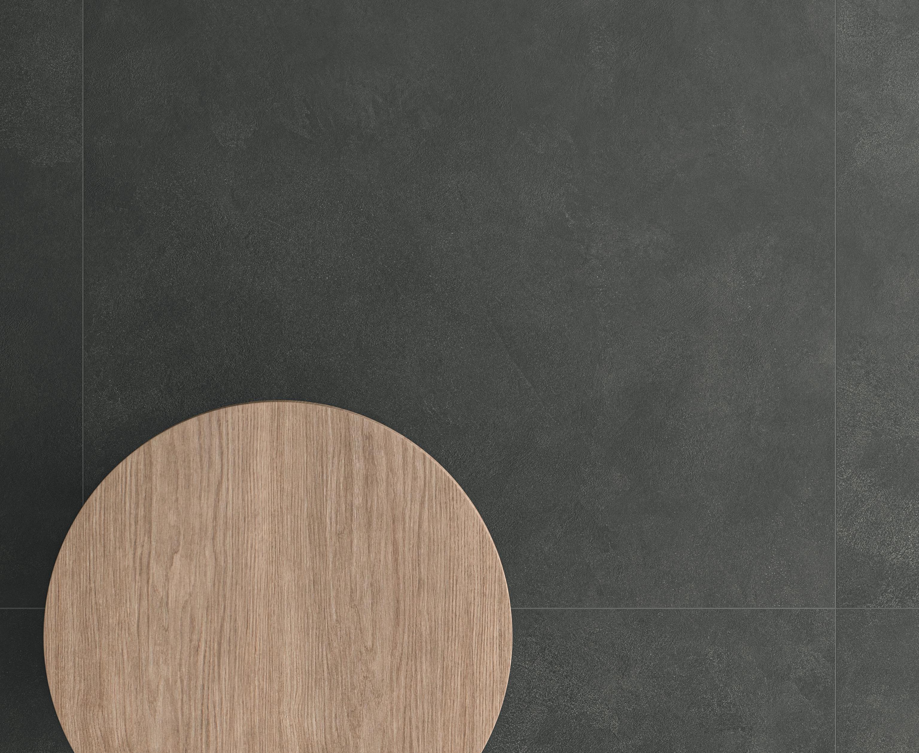
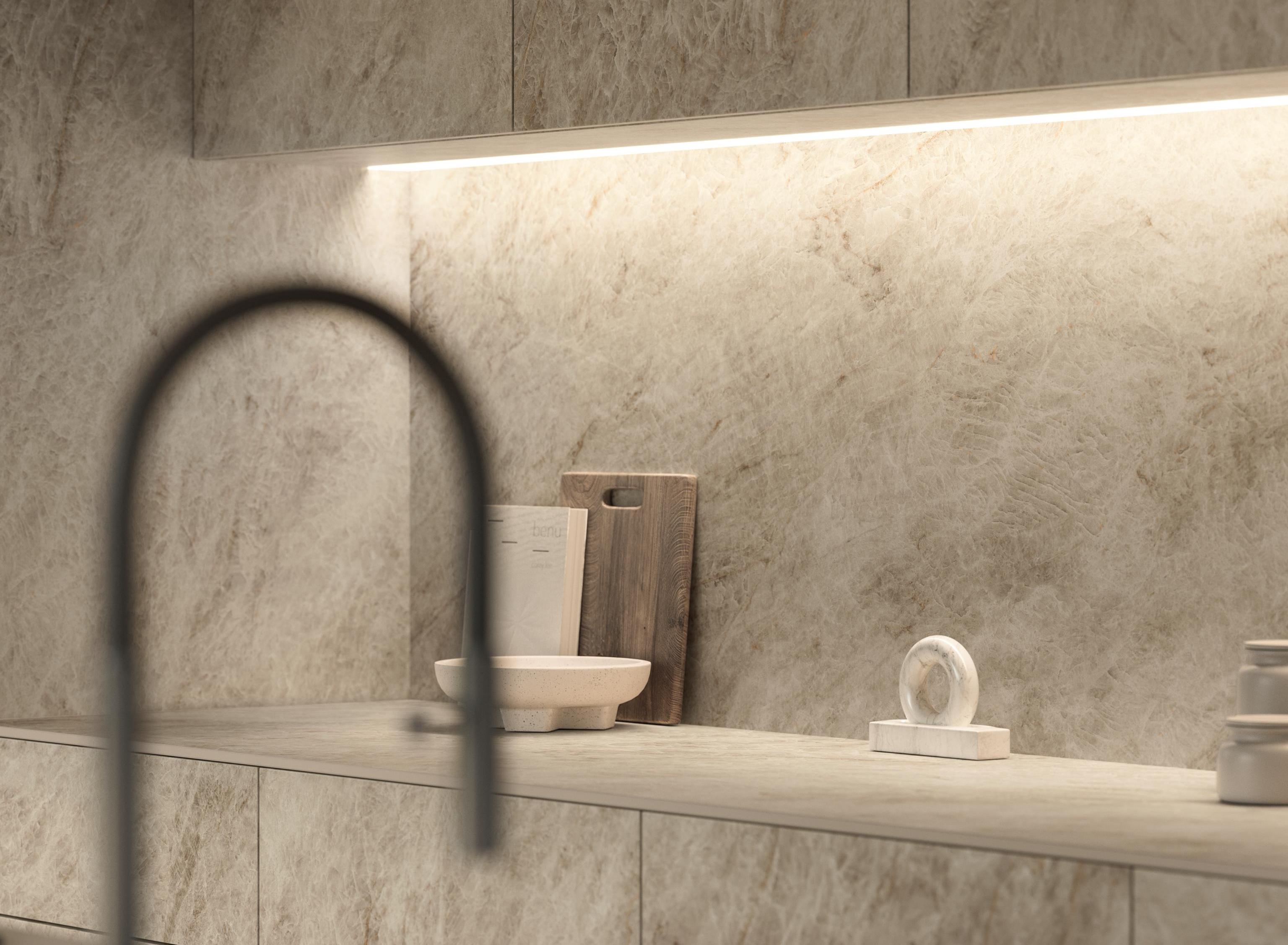
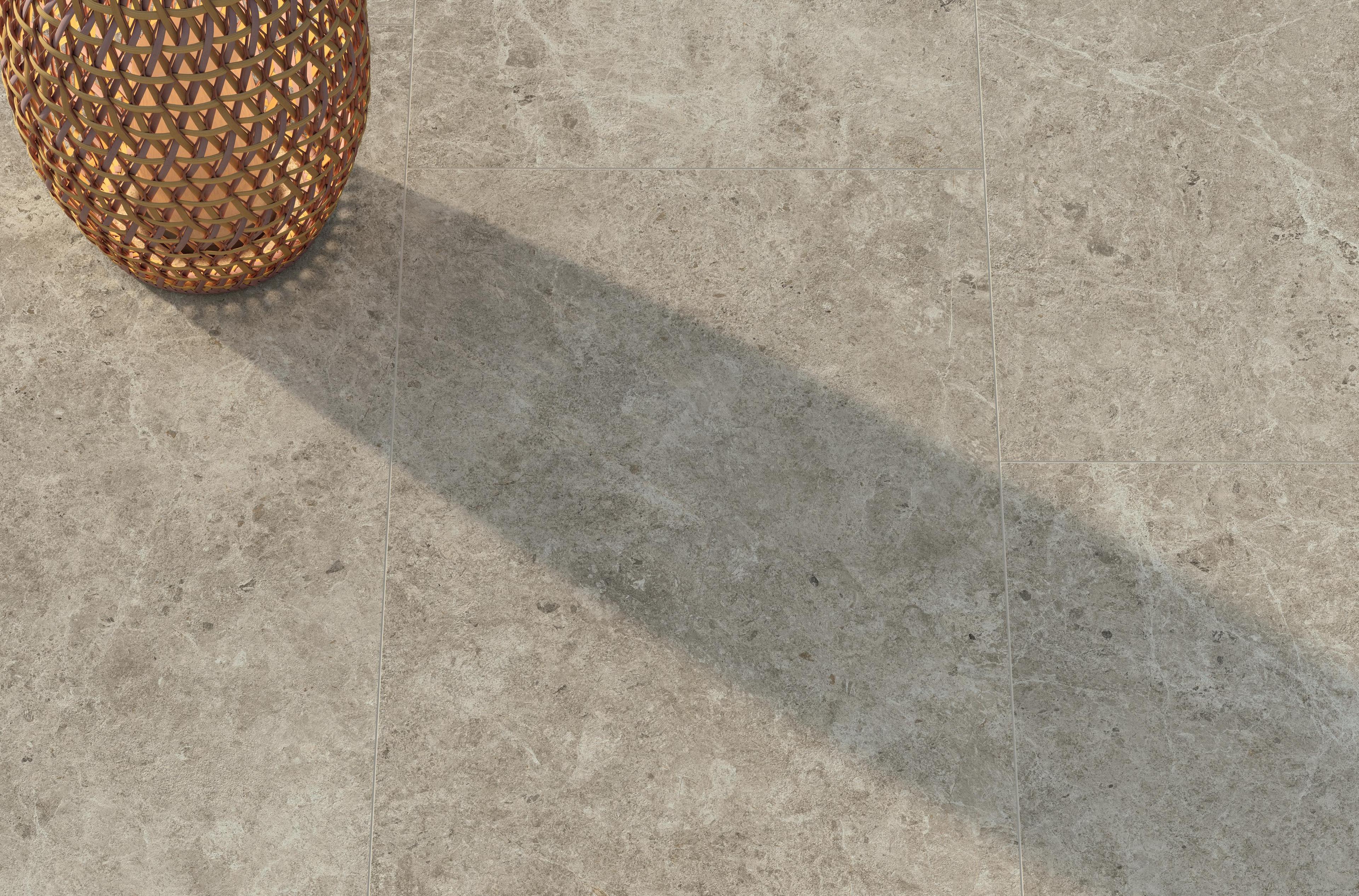
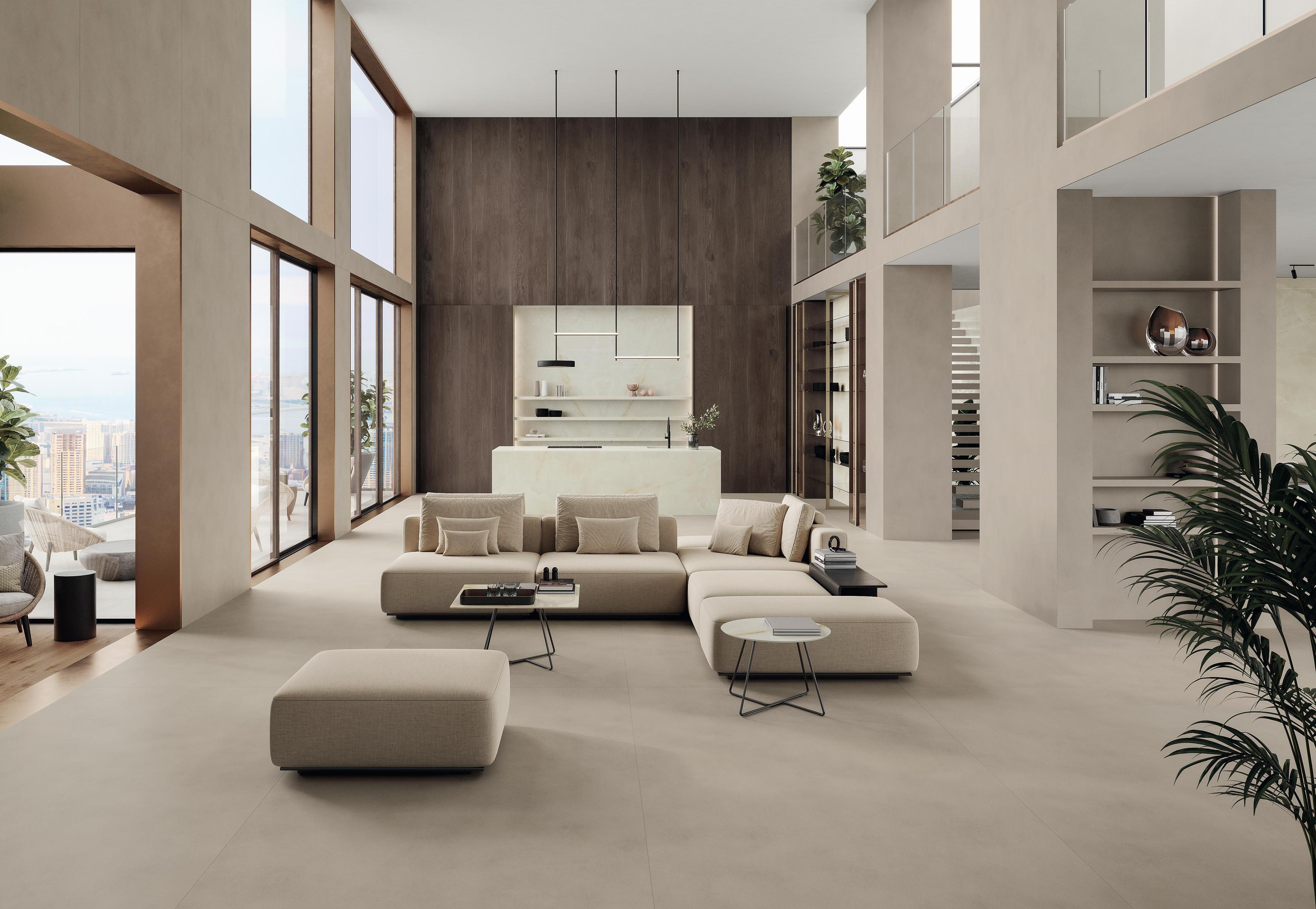
AtlasConcorde_BoostExpression_000_03_GrainShell_Shell_Camel

Trend

Minimalist Interior Design

design criteria for color, materials and light

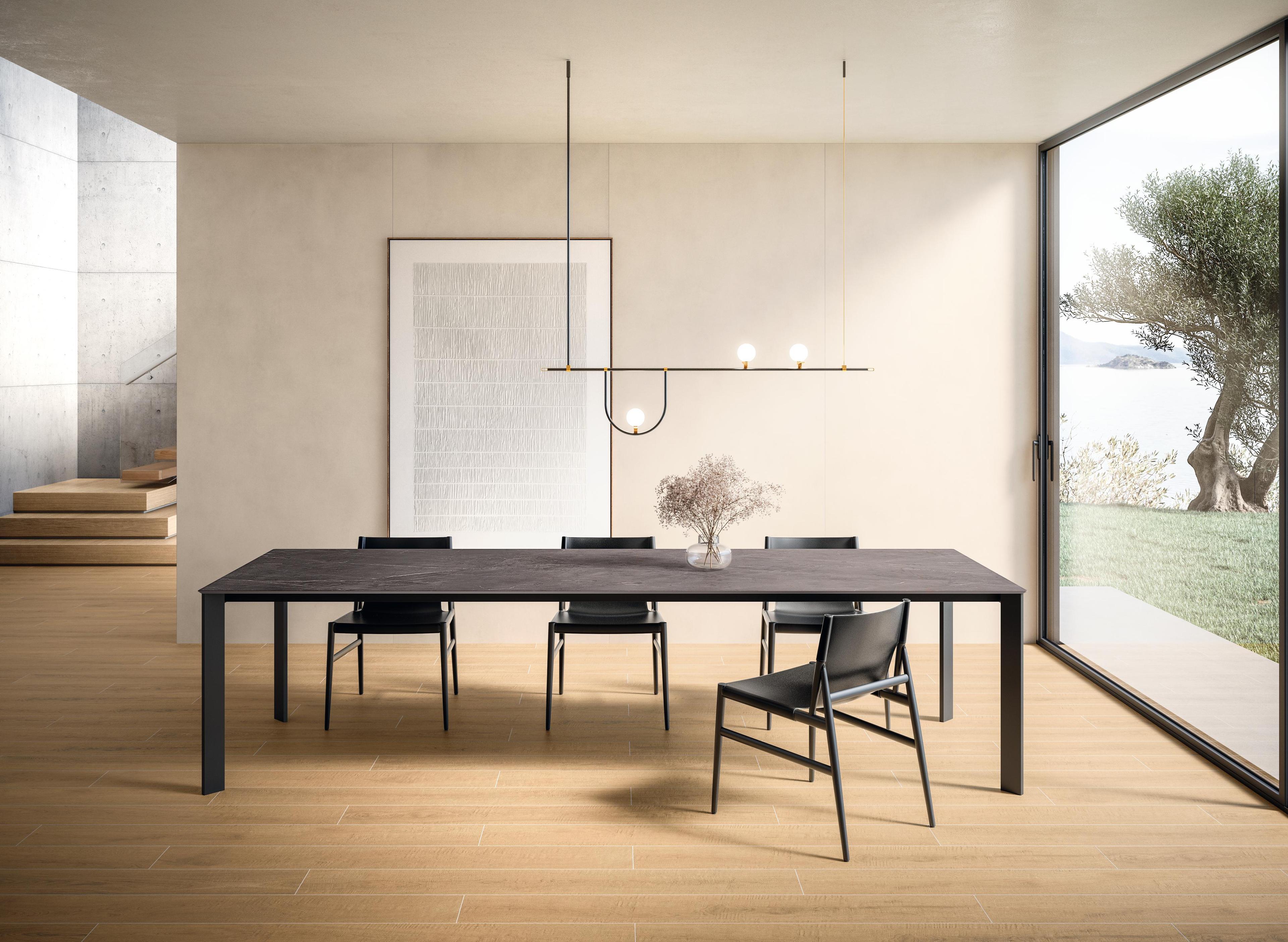
Minimalist interior design does not simply mean reducing the furniture or choosing monochrome spaces. It is an approach based on simplicity, balance and design quality, in which every element is selected in relation to the proportions of the space, to its function and to its dialogue with surfaces, volumes and light. Essentiality is therefore not a purely aesthetic outcome, but the end point of a conscious process, one that makes the composition clearer and the relationships between its parts easier to read.

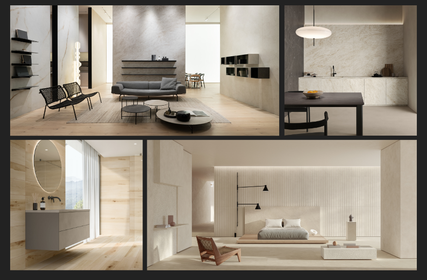
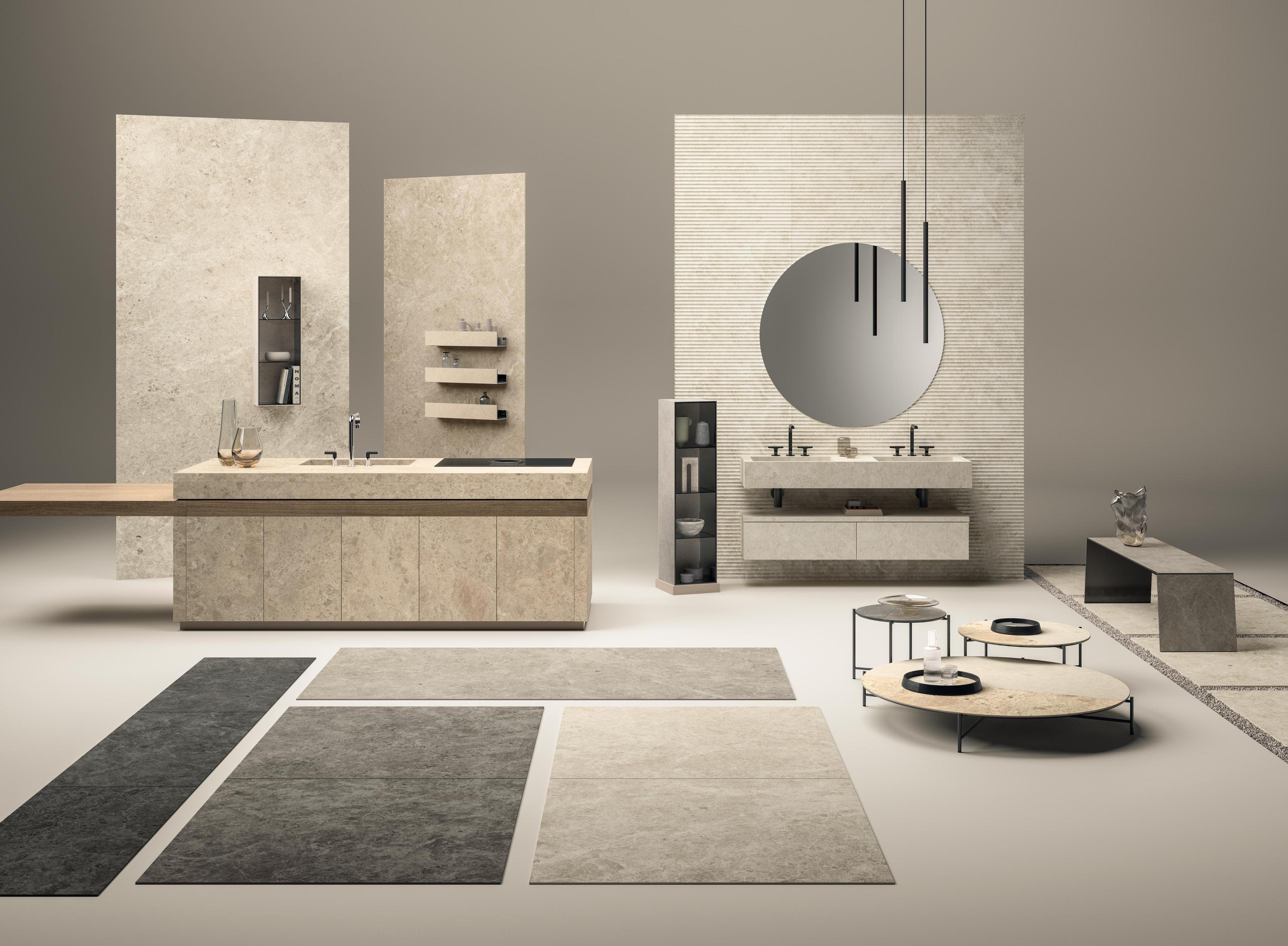
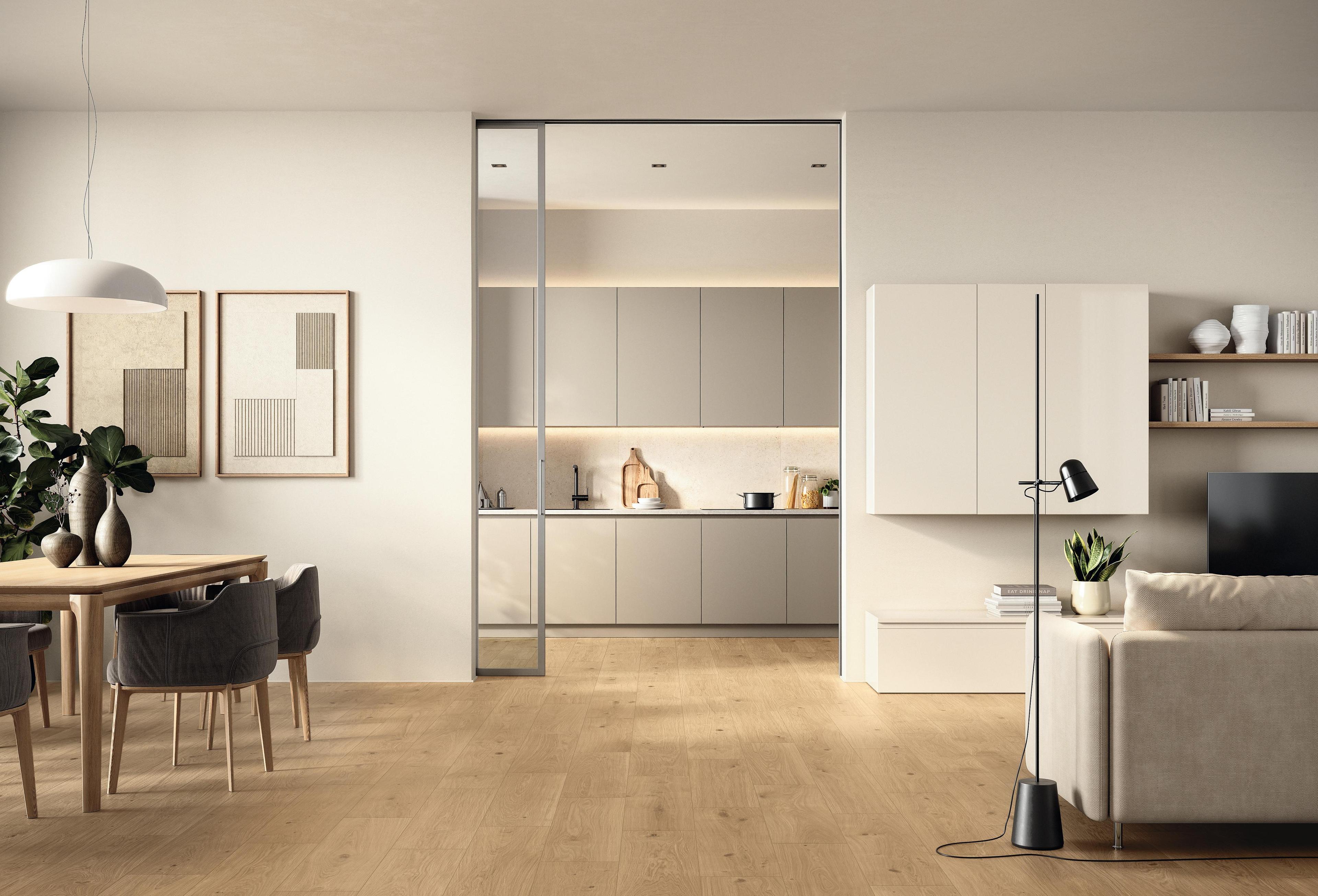
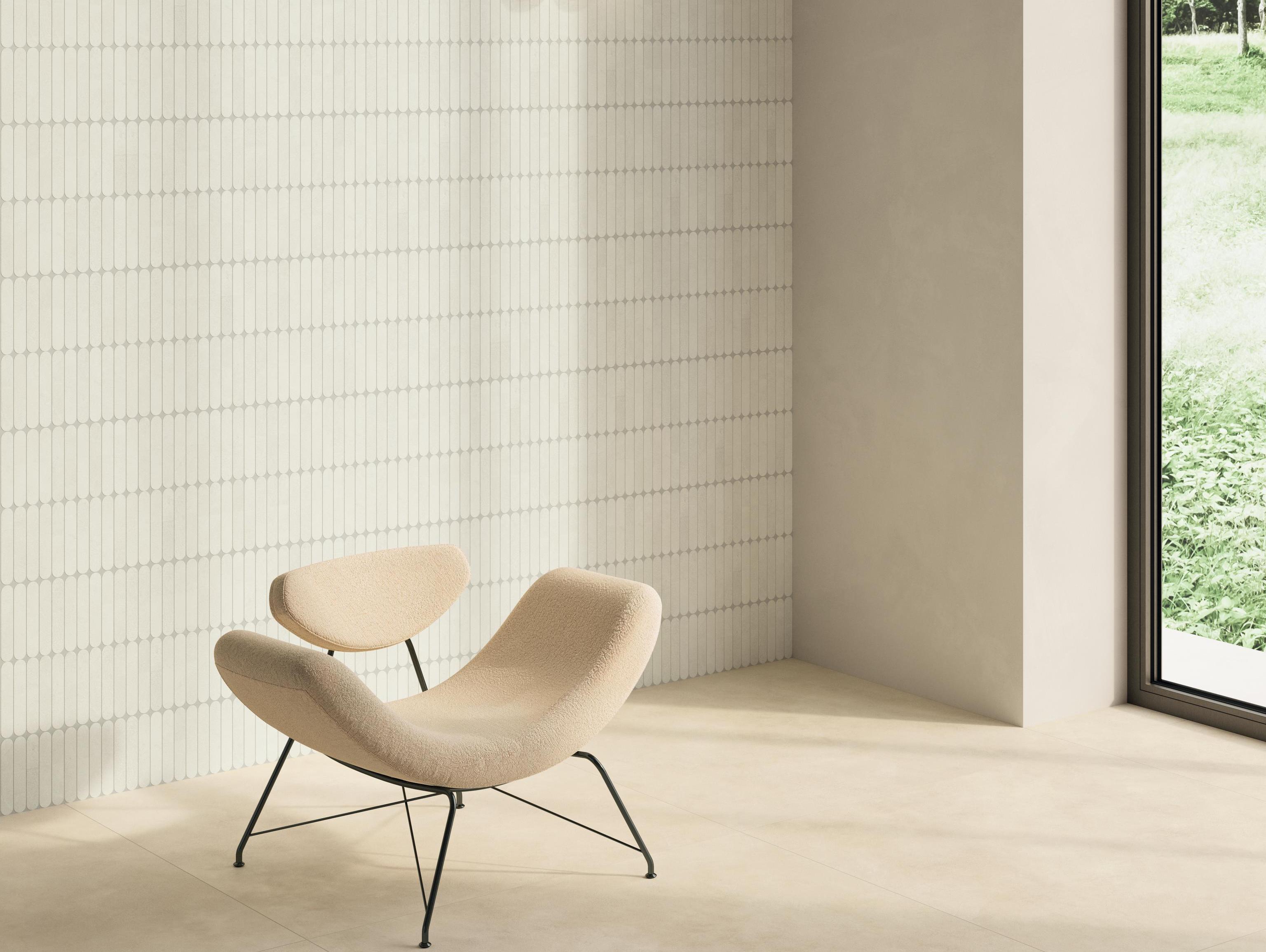
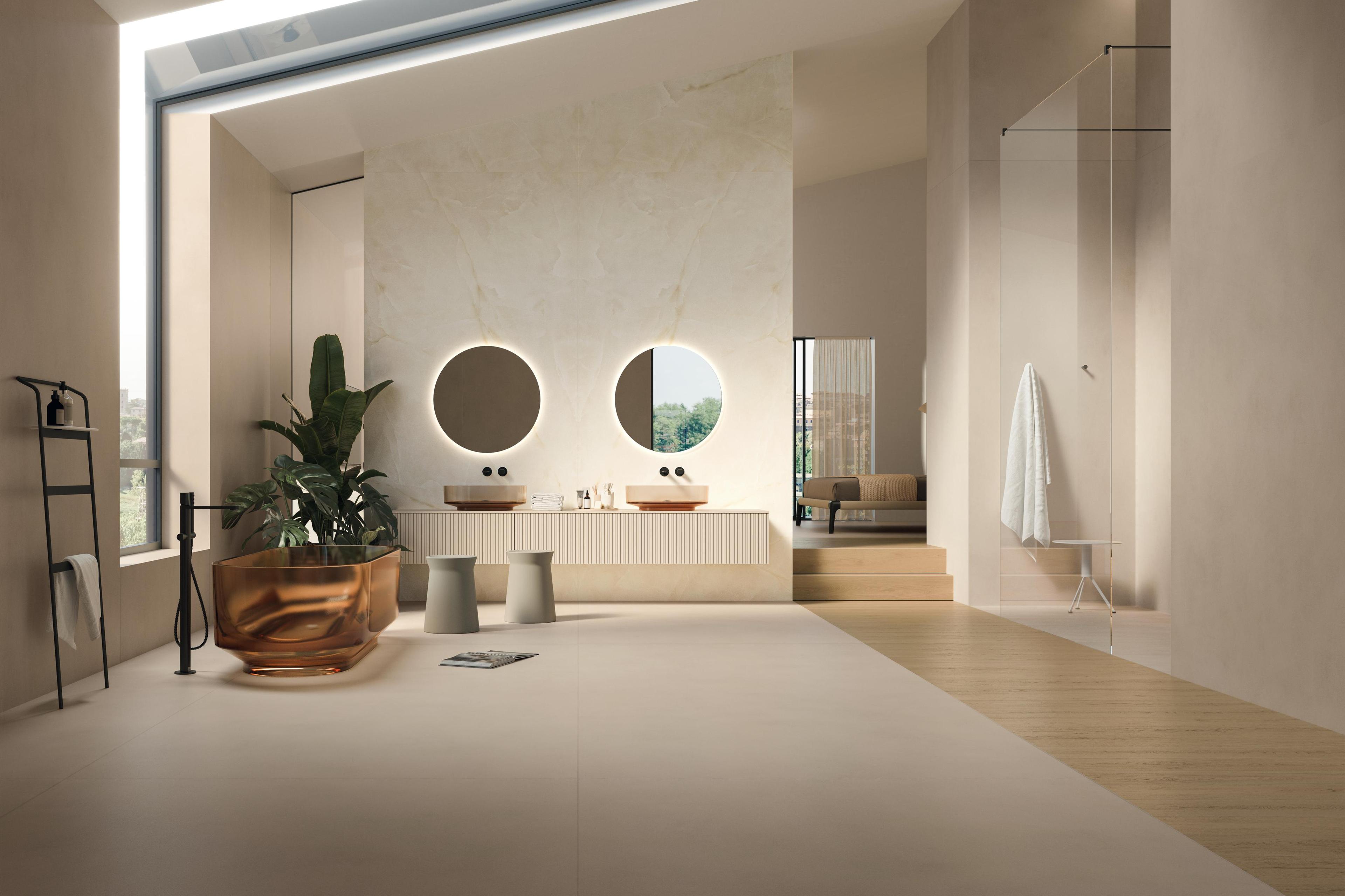
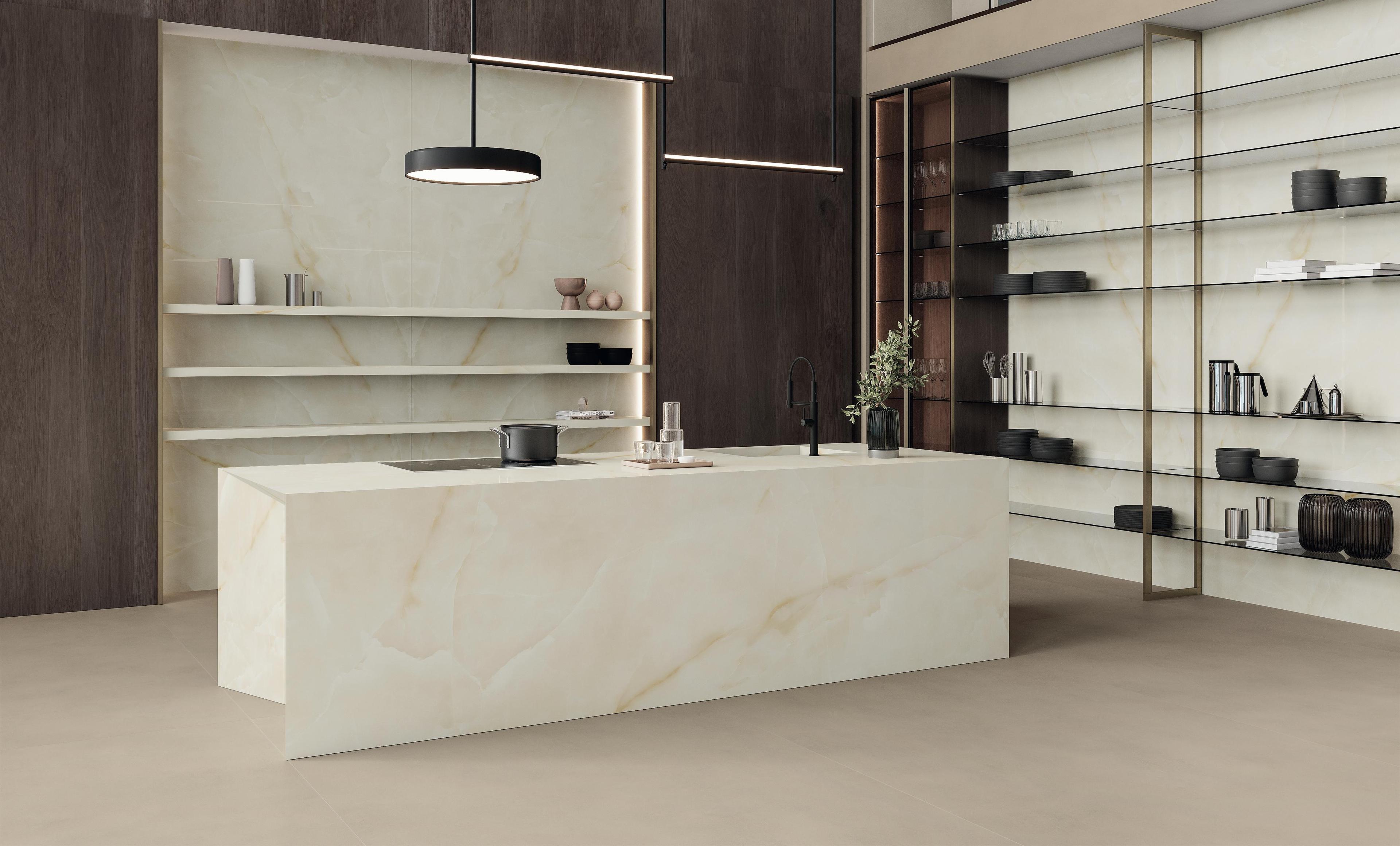
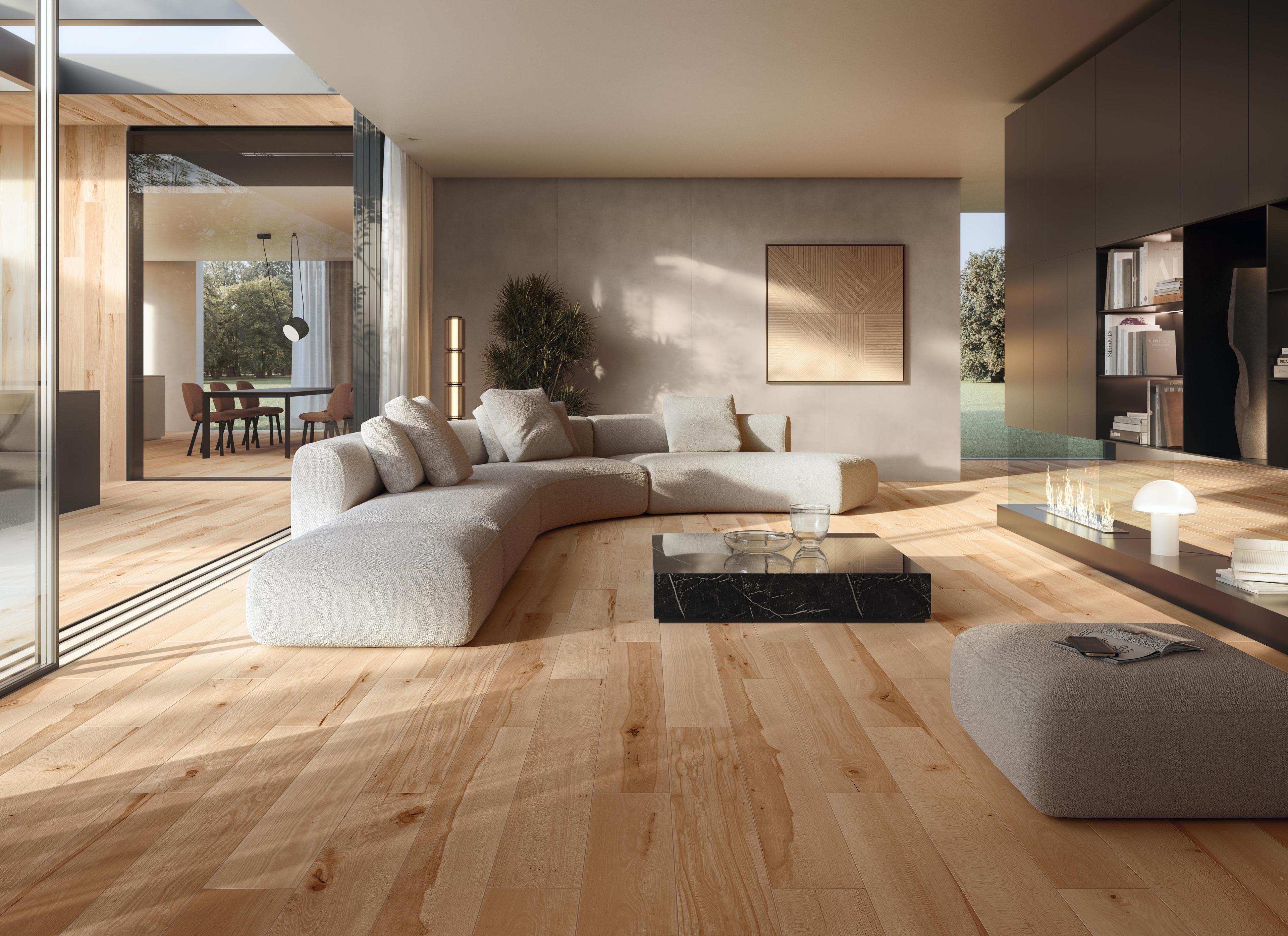
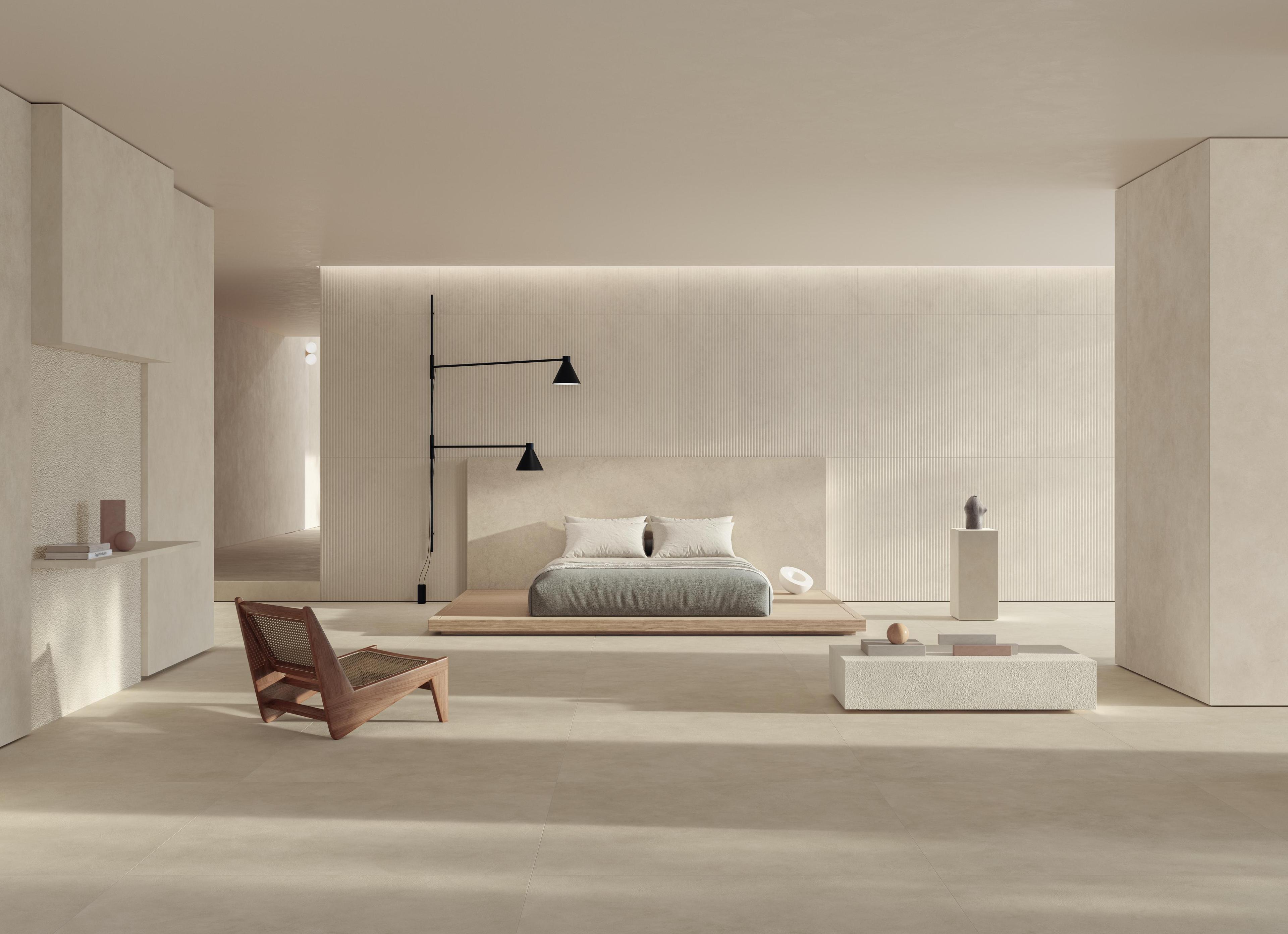
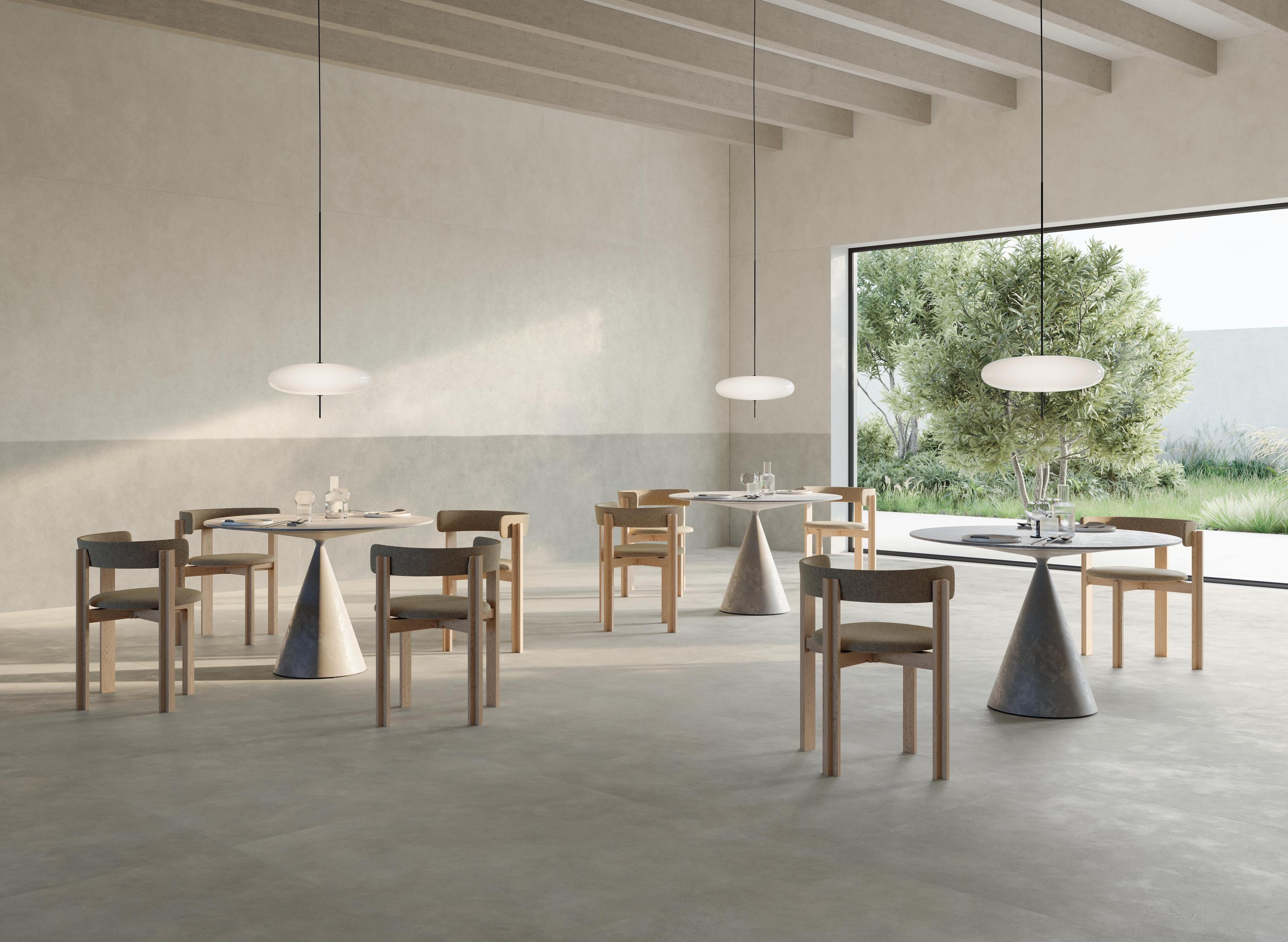
Alongside the most rigorous and monochrome interpretations, contemporary minimalism also embraces warmer, more material and more welcoming languages. Material takes on a central role: it is not used to add decoration, but to build atmosphere, define volumes and modulate the perception of the space through light.

The modern minimalist home thus arises from the balance between formal reduction and perceptual richness. Limiting the number of materials and colors makes it possible to enhance their quality, bringing out the design of the surfaces, the precision of the junctions, the proportion of the formats and the consistency of the combinations. To reduce is to select, identifying a few elements capable of supporting the overall identity of the project.

Interpreting the minimalist home in professional terms ultimately requires these principles to be turned into concrete, verifiable choices. The definition of the concept must engage with the construction of the palette, the assessment of samples and finishes, the choice of formats and the development of the laying patterns. Every solution must be presented clearly, compared under the real conditions of the space and translated into applicable guidance.Minimalist design becomes a shared language between designer and client: not an aesthetic to be applied, but a method for turning reduction into perceived quality.

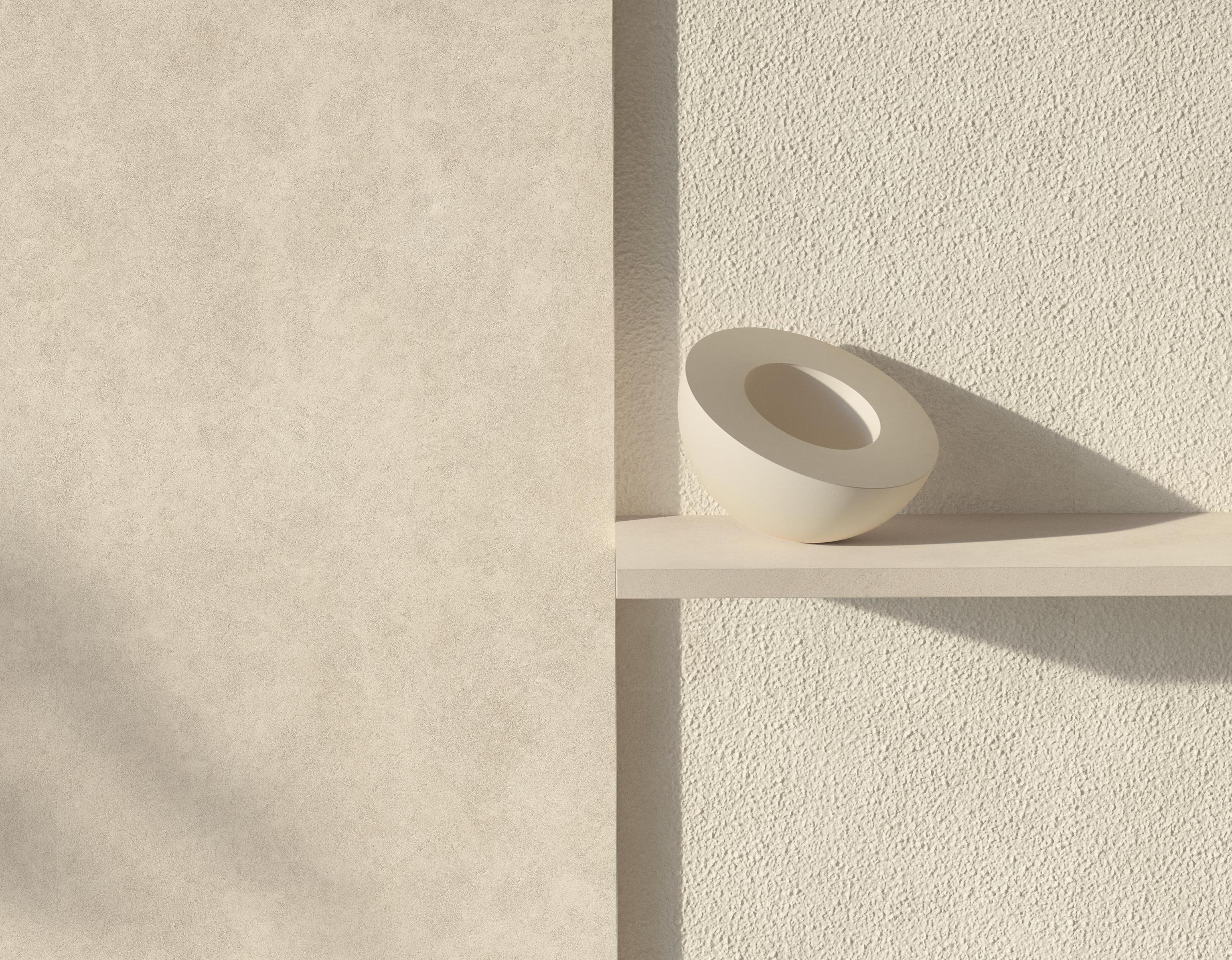
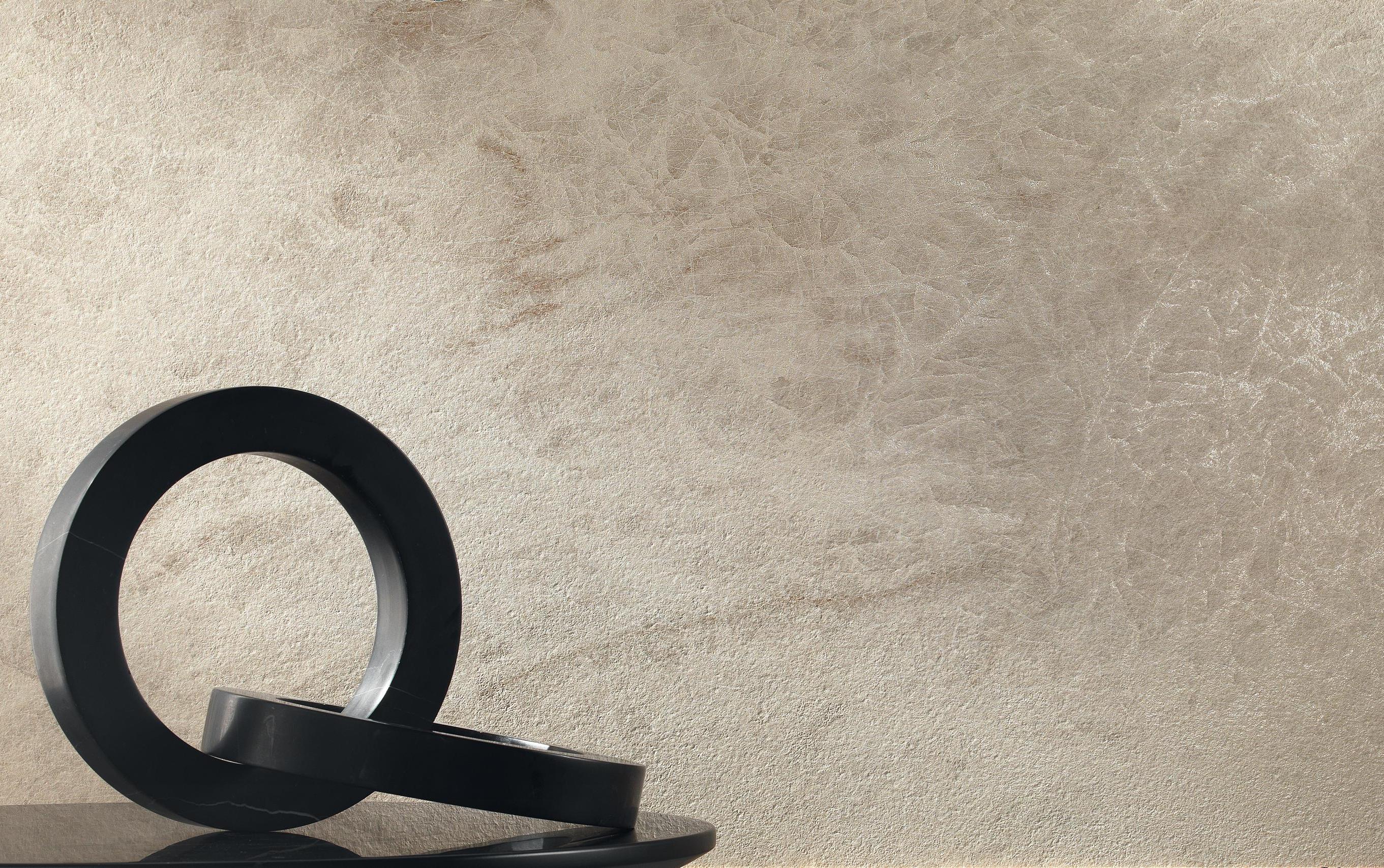
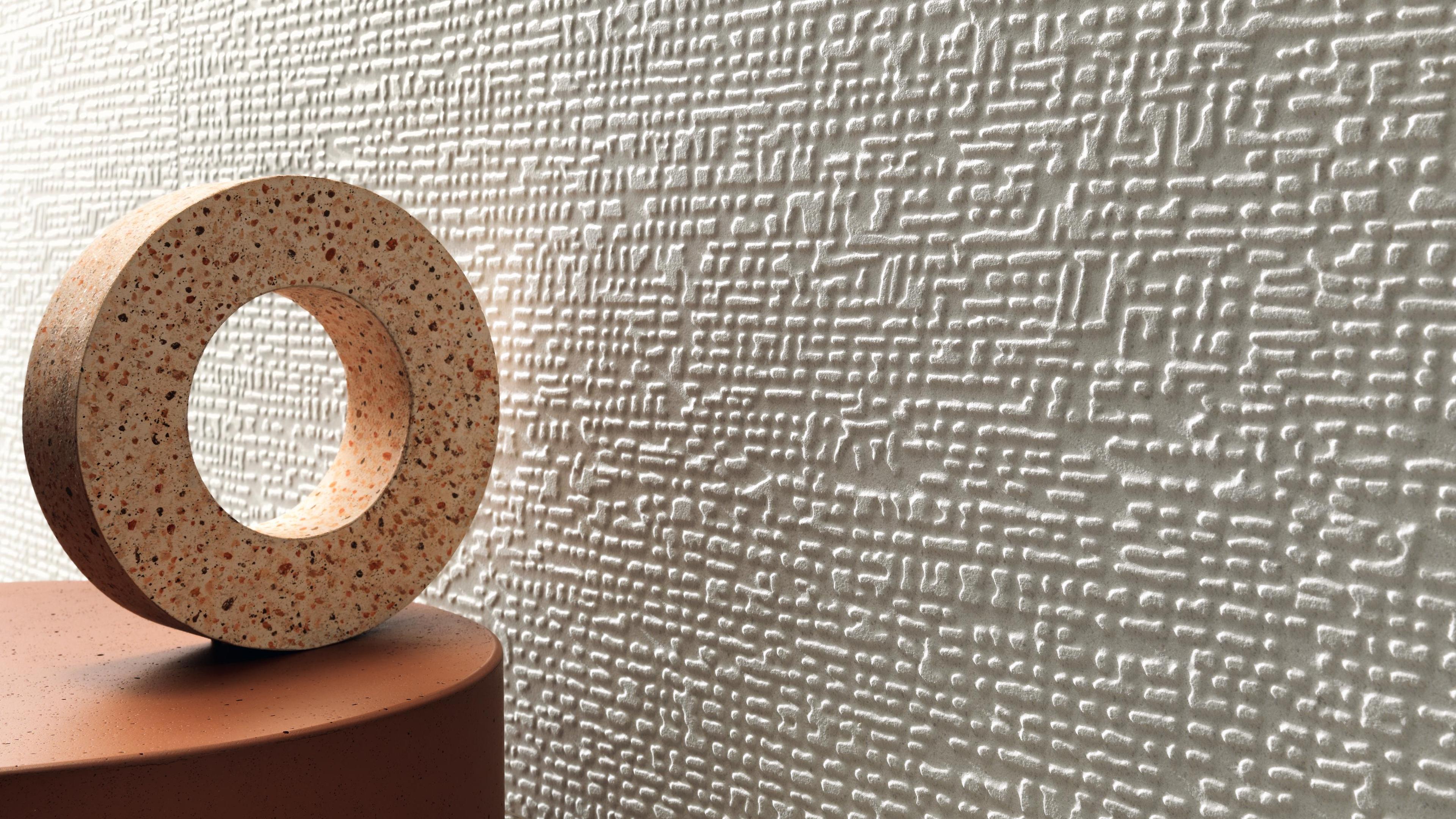
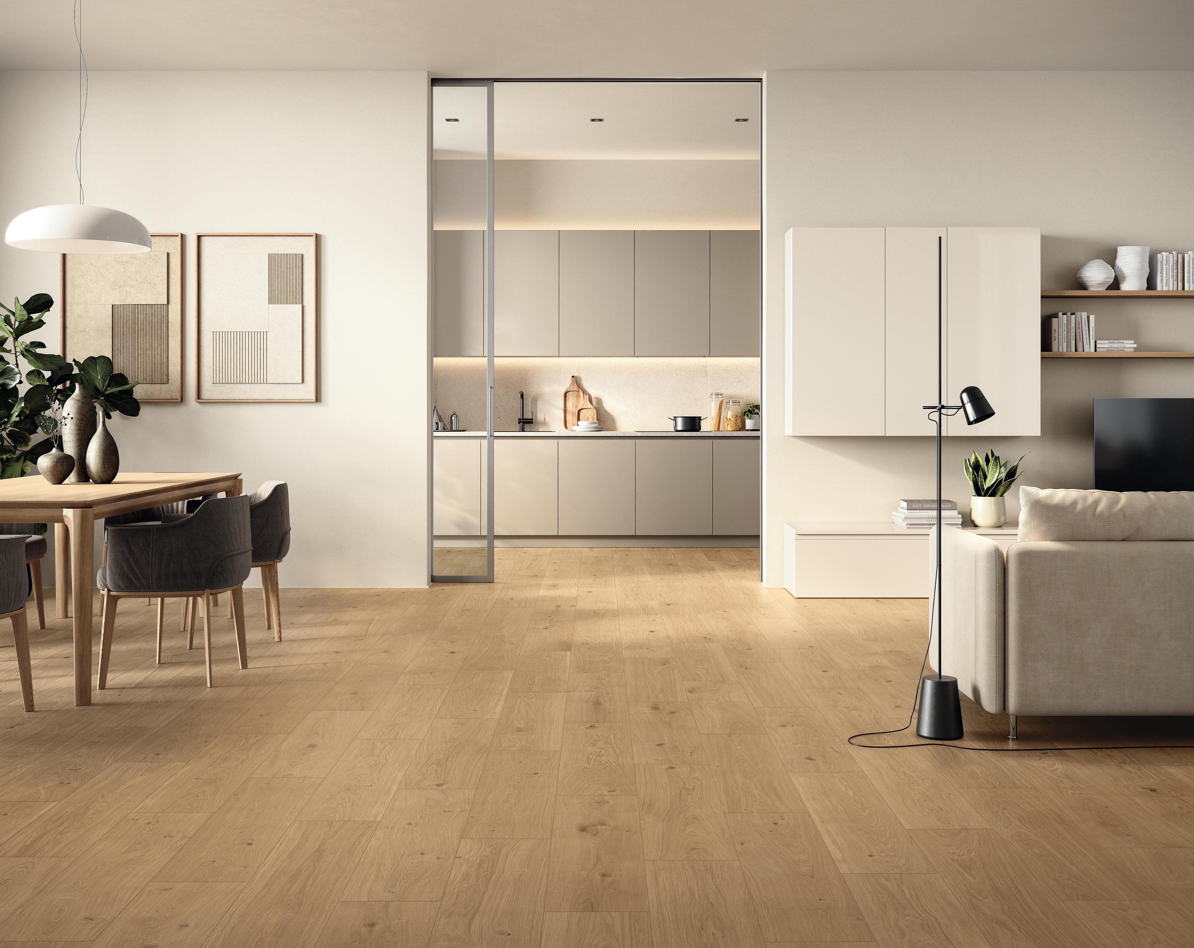
AtlasConcorde_NyraUtopia_003_12_Popcorn
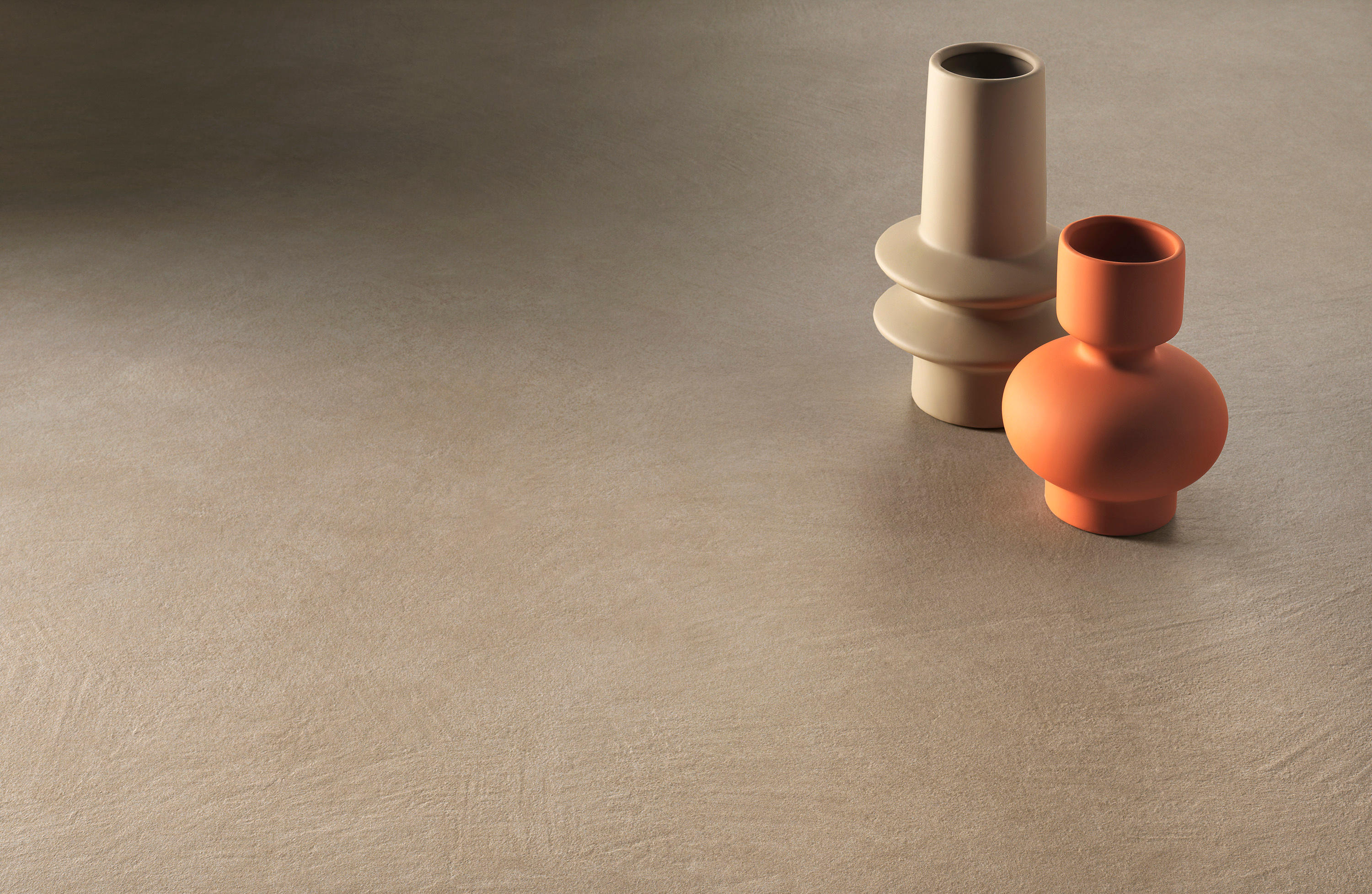
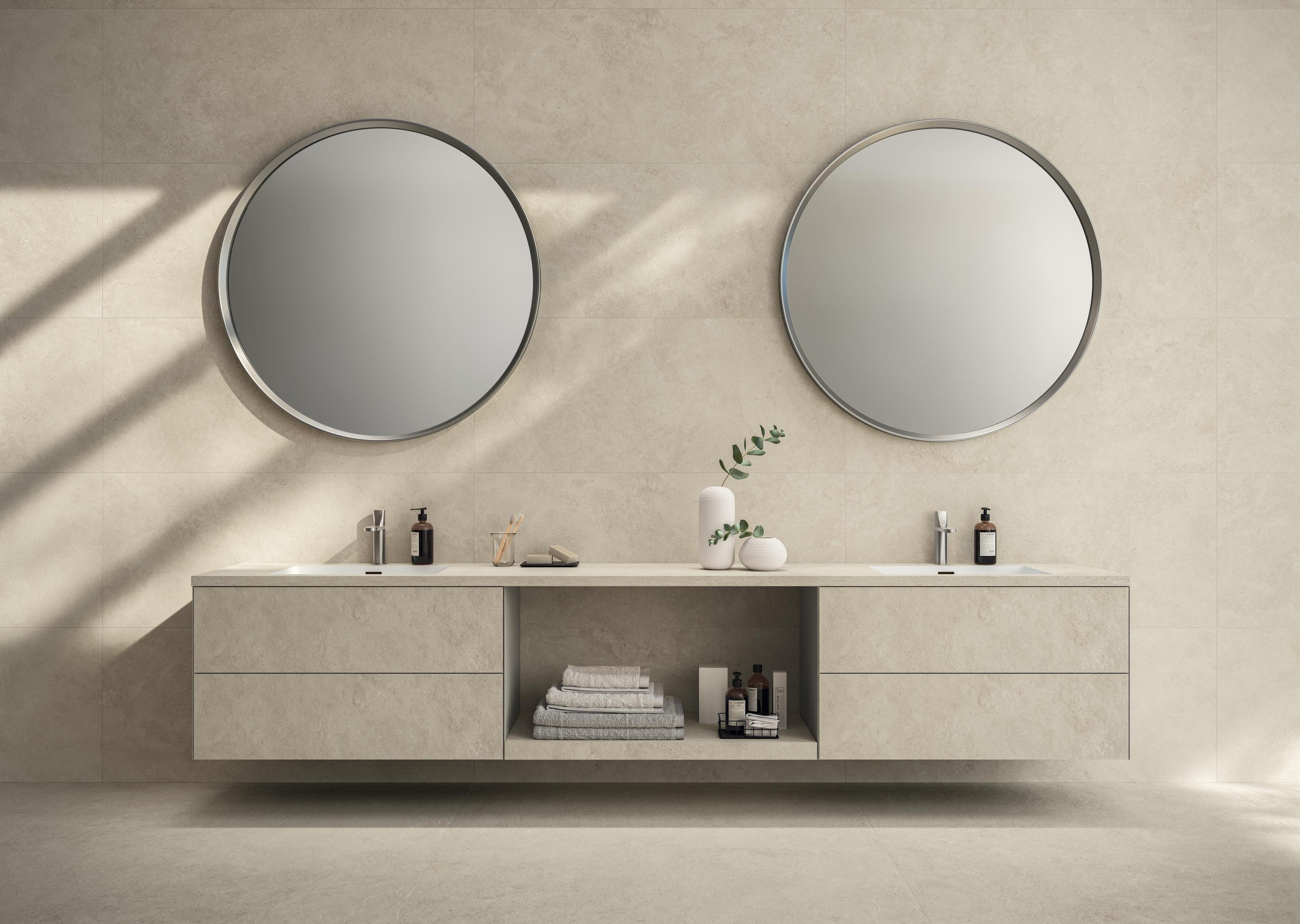
AtlasConcorde_NyraUtopia_003_11_PopcornEarthQuake

Colors and palettes for minimalist interiors

In an essential project, color is not an accessory element: it defines the perception of volumes, alters the response to light and creates continuity between surfaces and furniture.

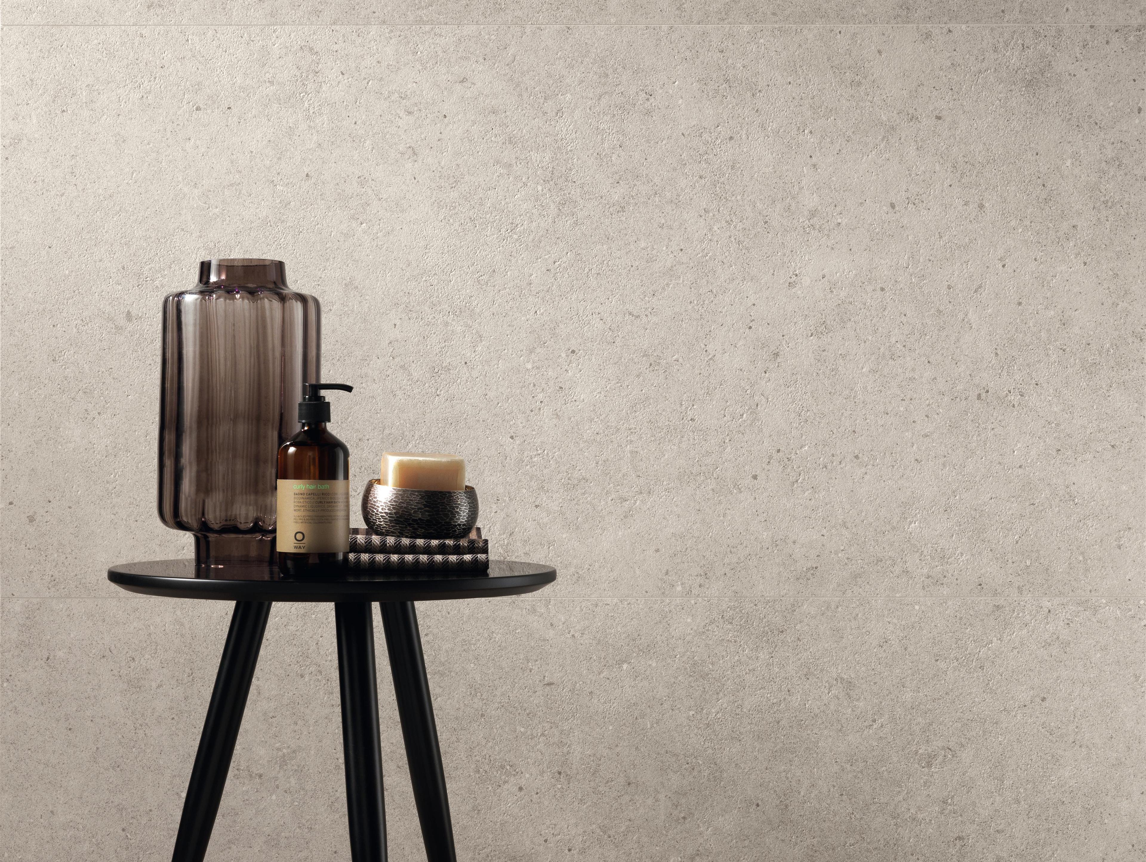
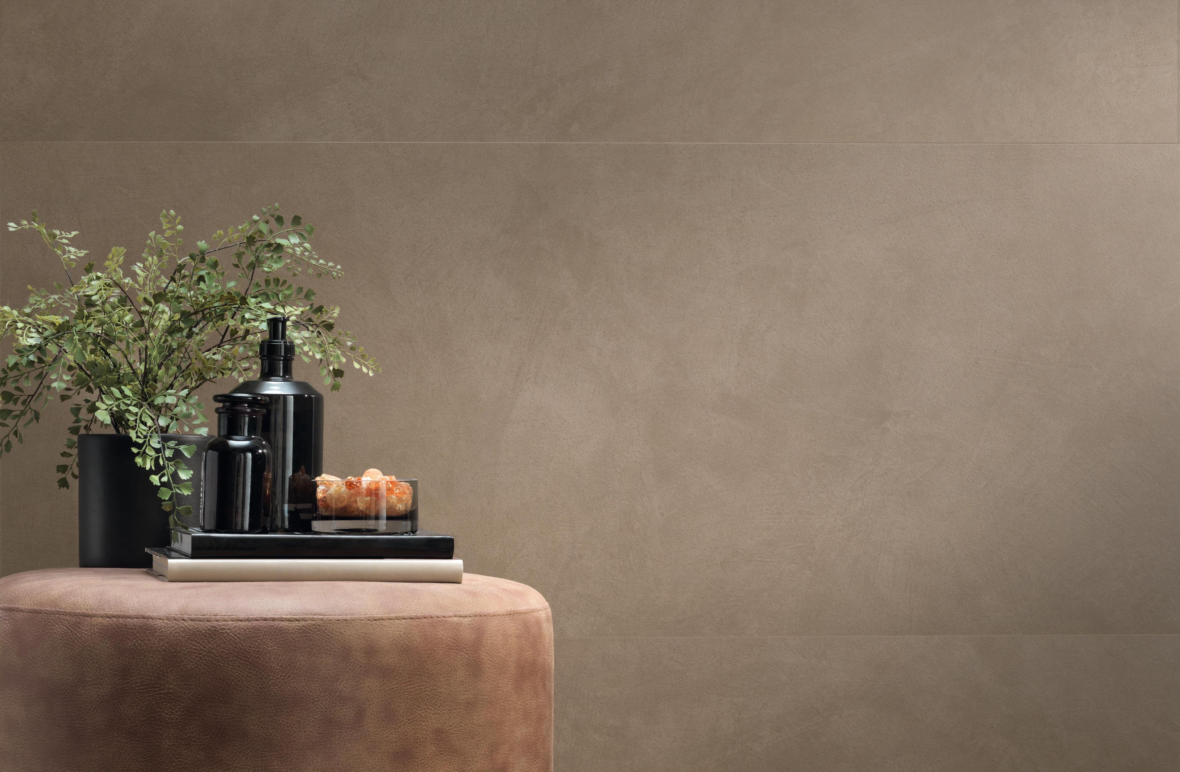
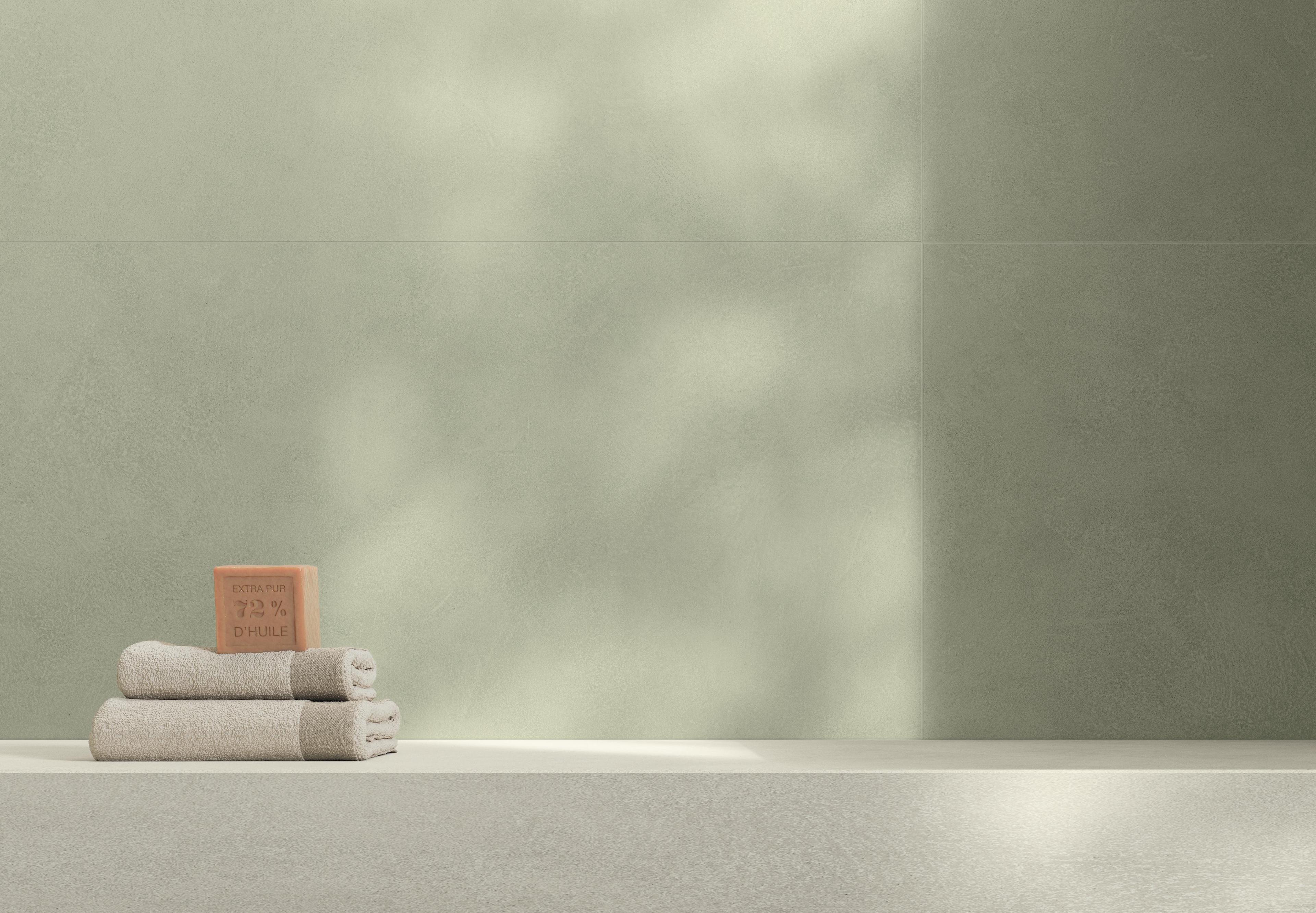
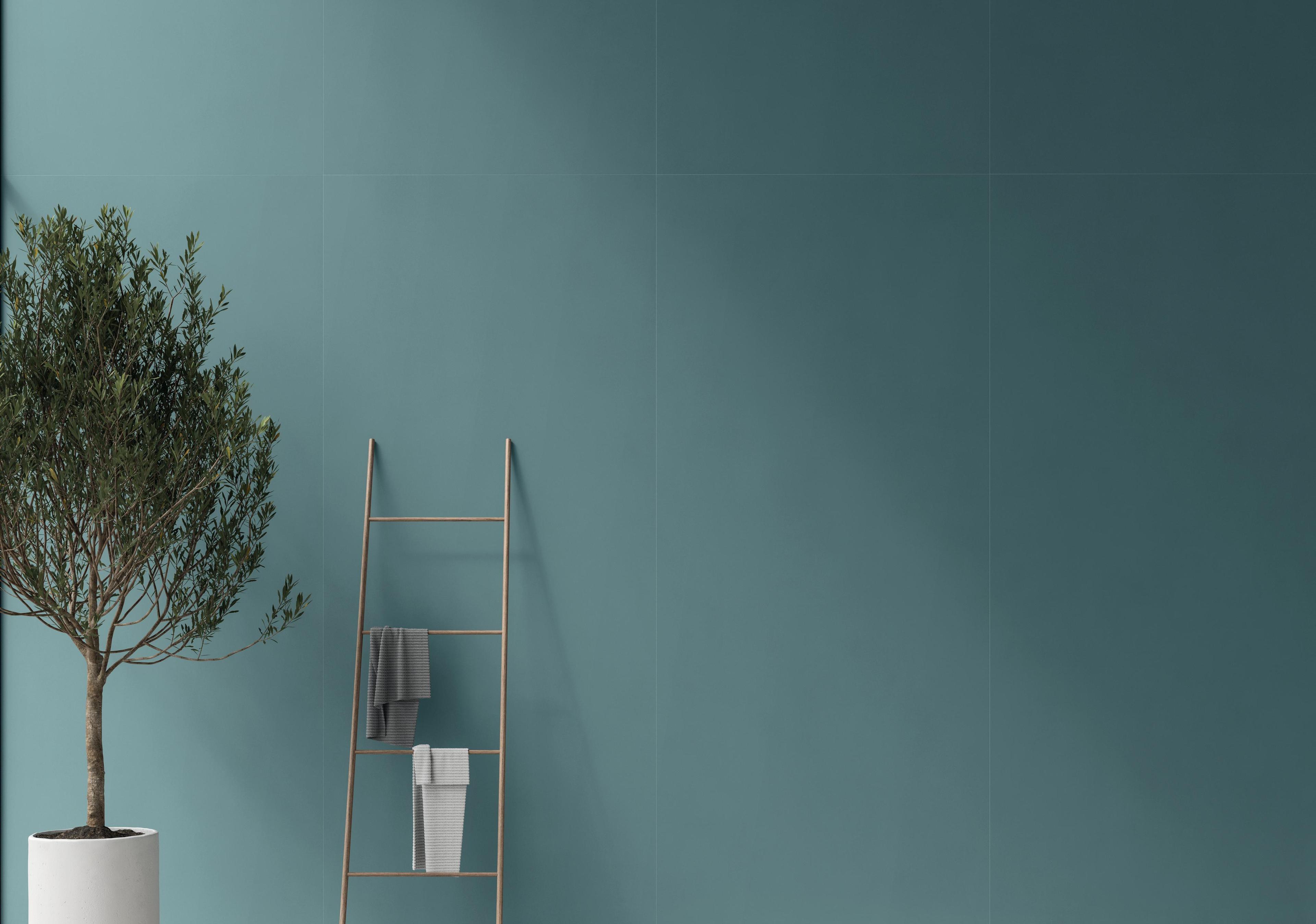
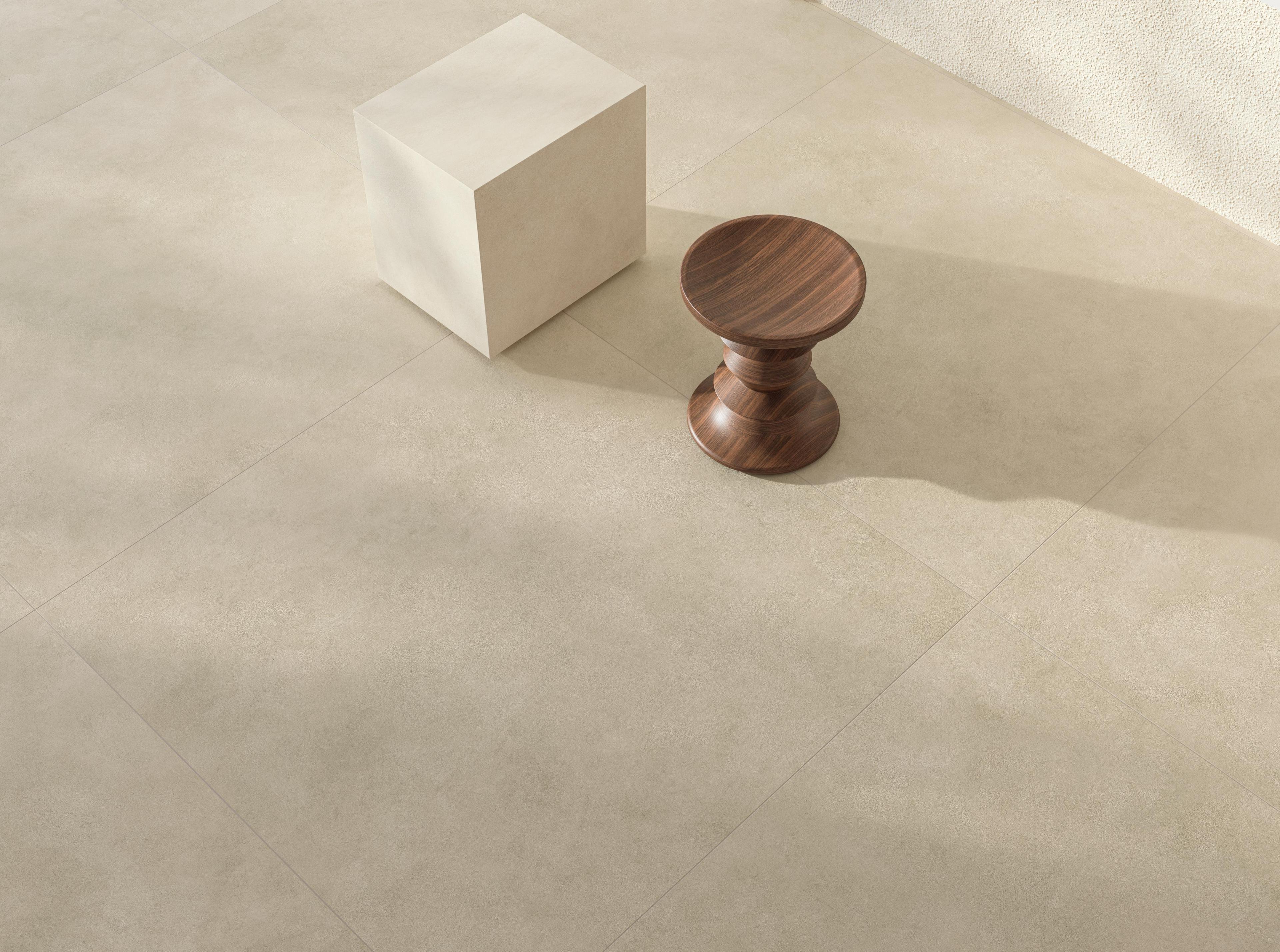
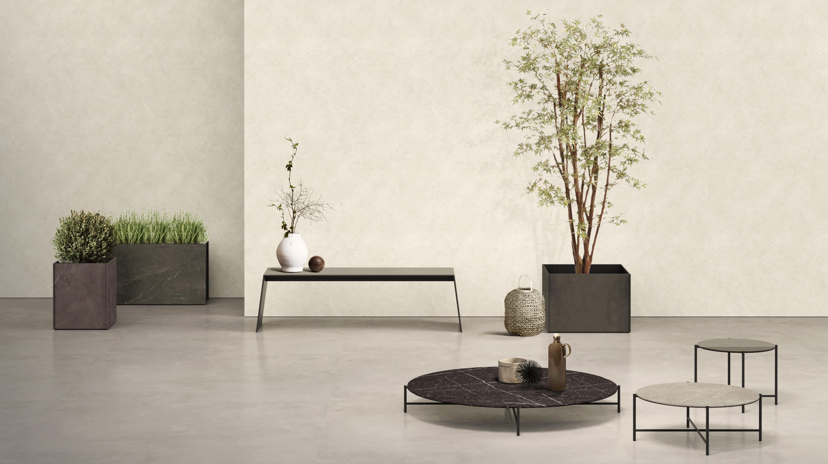
A minimalist color palette can start from warm whites, beige, sand, taupe, mineral greys and earthy tones. Rather than applying a uniform neutrality, it is useful to build a hierarchy made up of one dominant color, related tones and a few accents. Floors and wall tiles form the visual base of the project and can guide the selection of the other elements, creating a coherent backdrop capable of giving depth to spaces without fragmenting the way they are read.

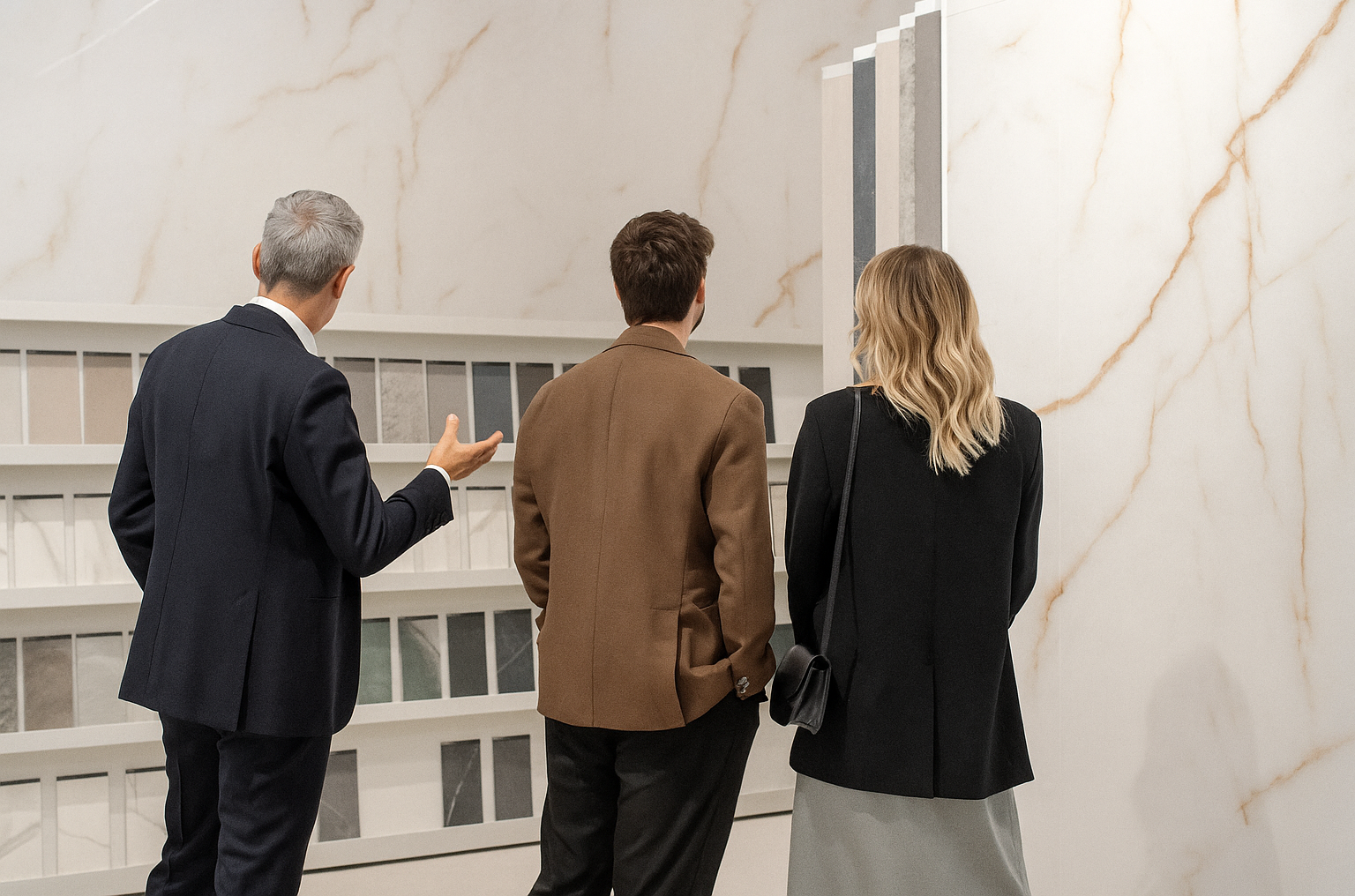
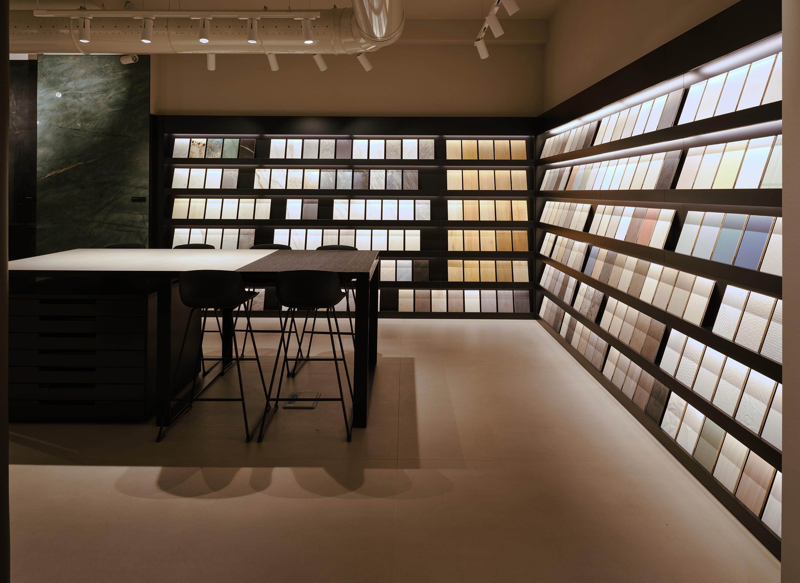
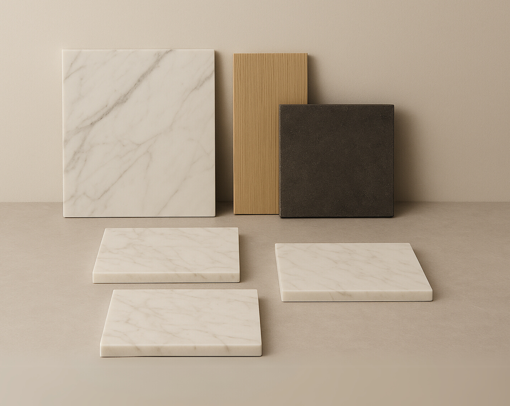
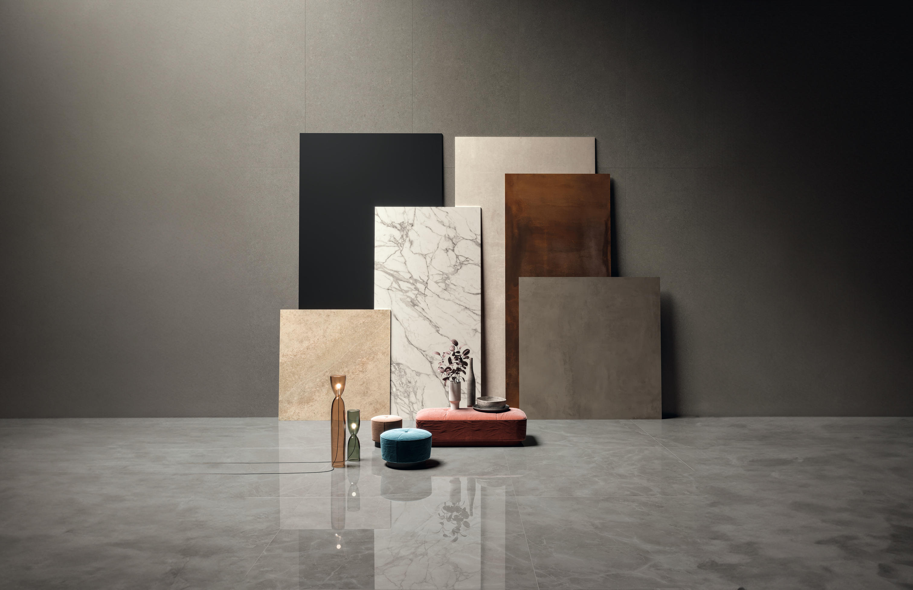
The choice of color must be verified under the real conditions of the space. Orientation, the size of the openings and the temperature of the artificial light can significantly alter the perception of a surface. Moodboards and side-by-side samples make it possible to assess undertones, textures, finishes and relationships with the furniture all together, making the proposal clearer and reducing the risk of combinations that are formally correct but far from harmonious once applied.

Materials, textures and finishes for minimalist interiors

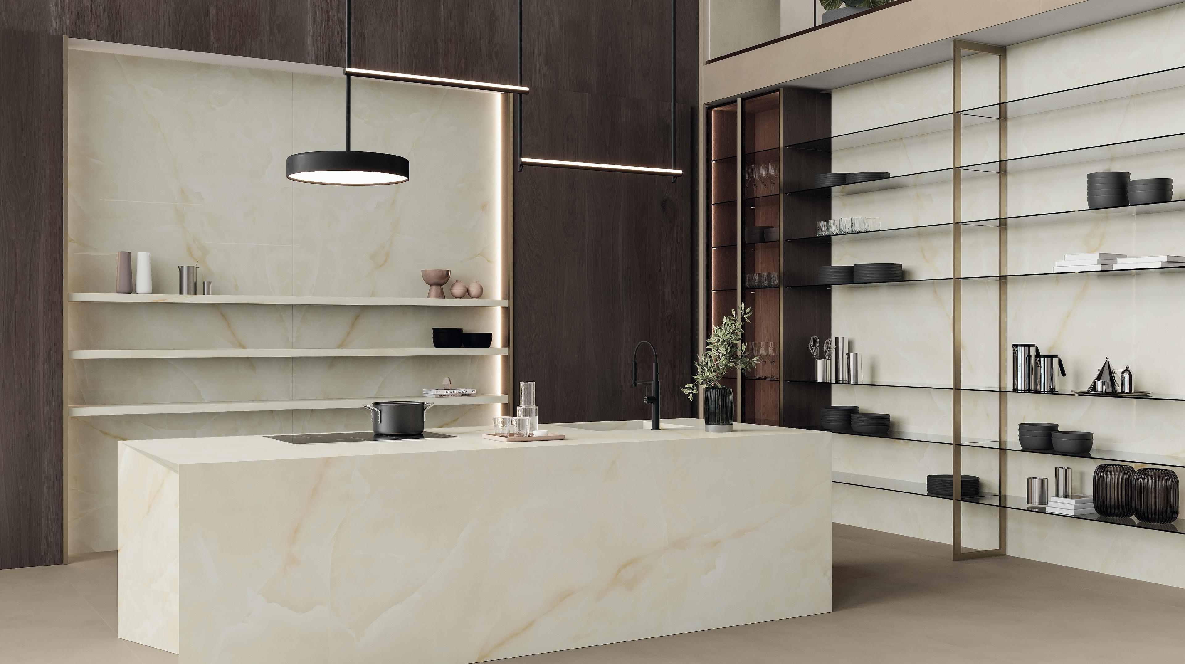
Materials for minimalist interior design build identity through subtle differences. When elements are reduced, the grain, the reflection of light, the layout of the grout joints and the relationship between matte, material or three-dimensional surfaces all become more evident.

Textures and finishes: essentiality without uniformity

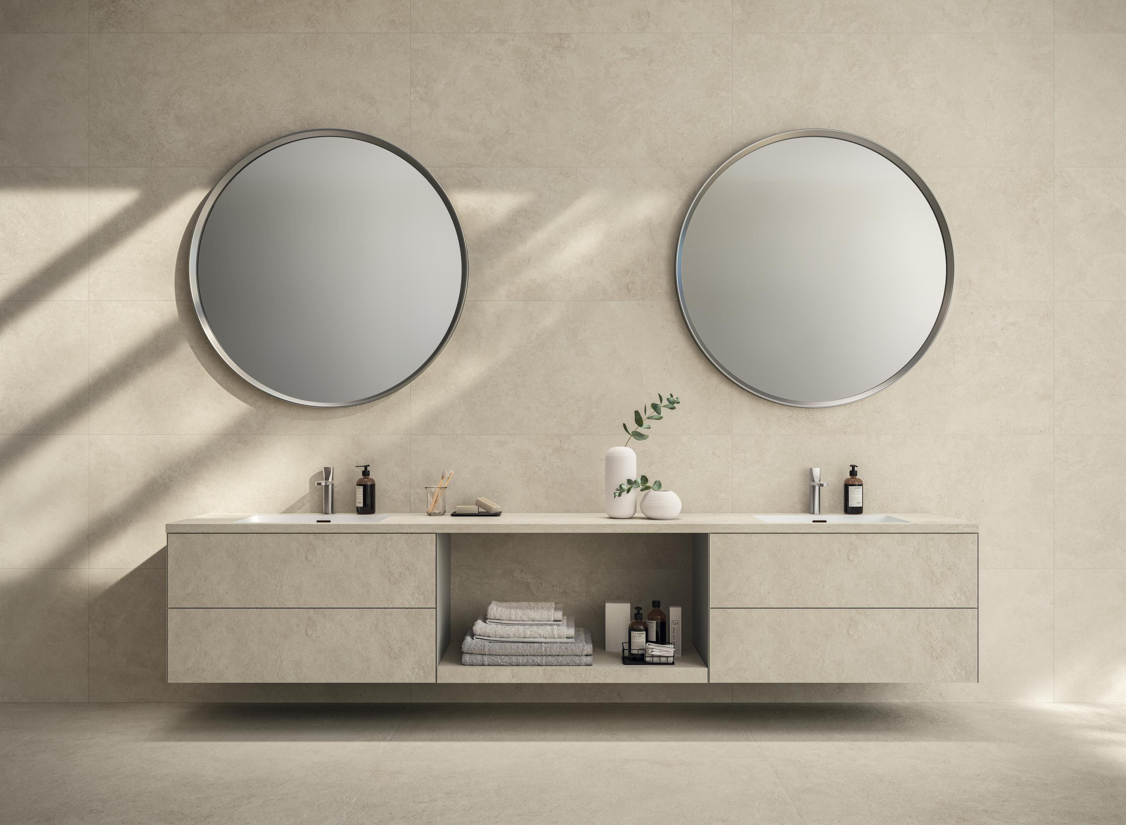
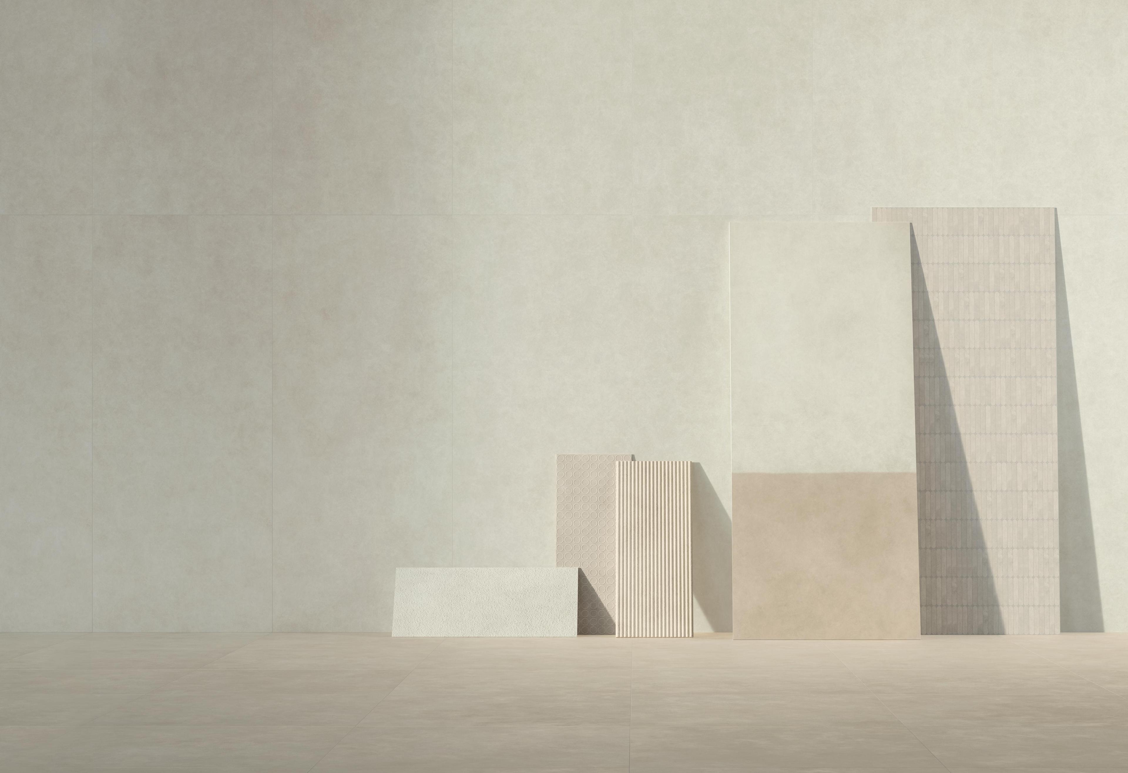
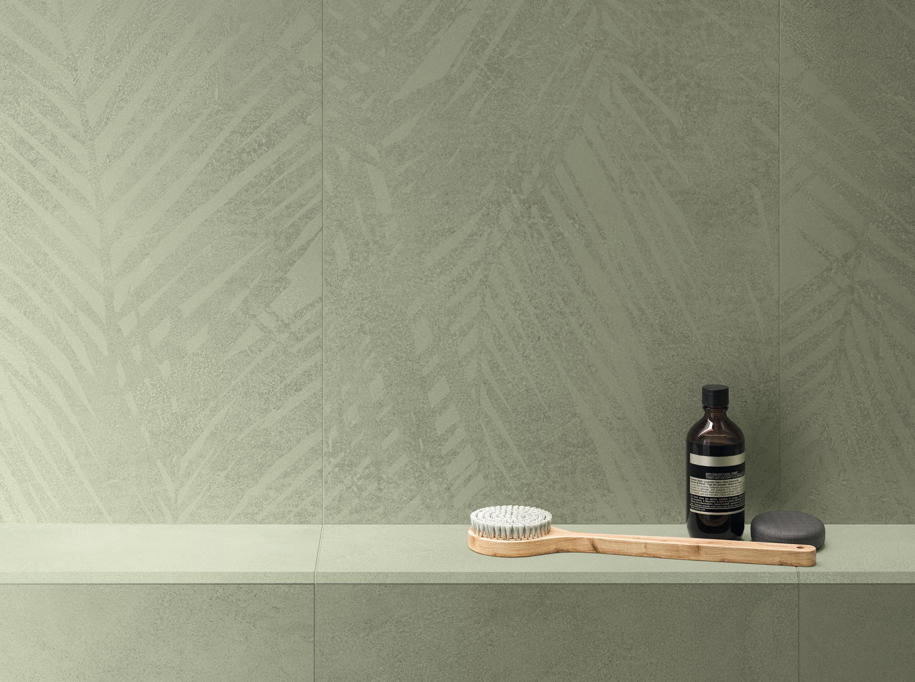
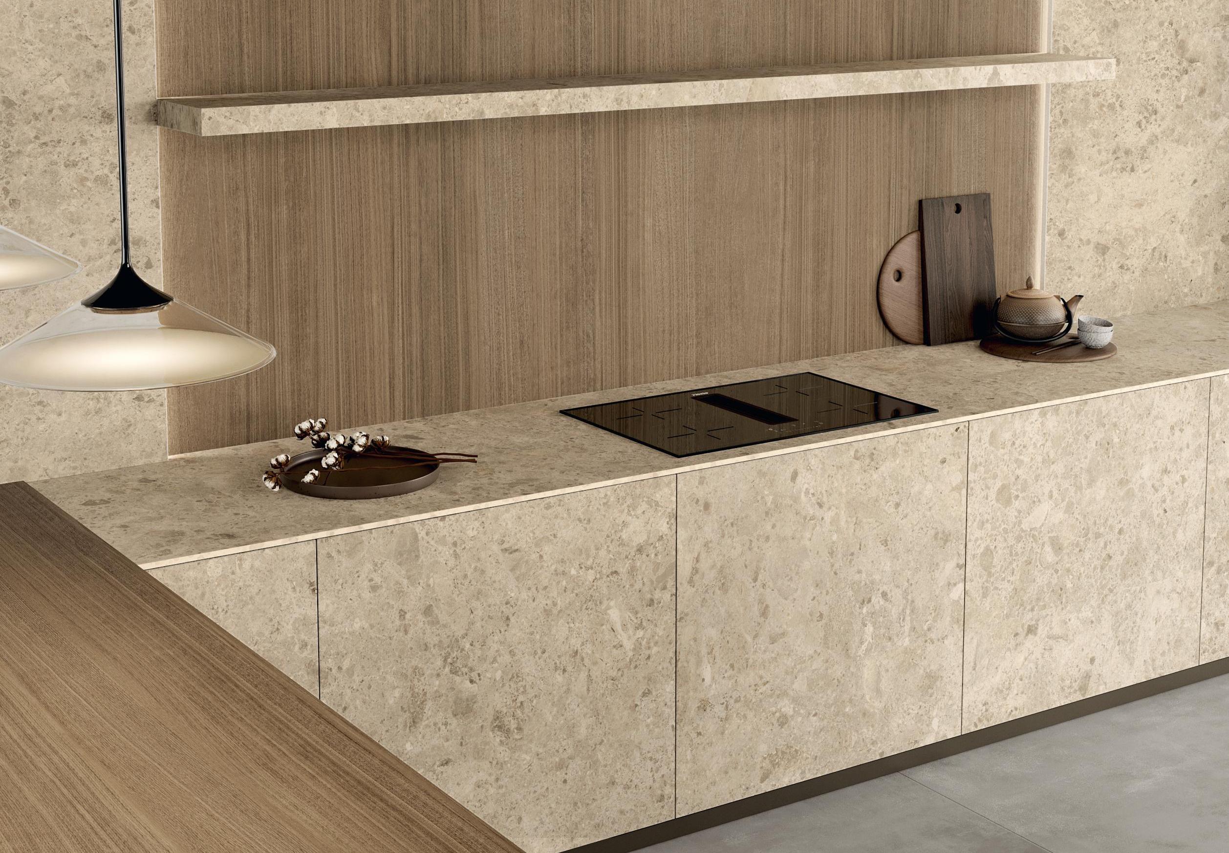
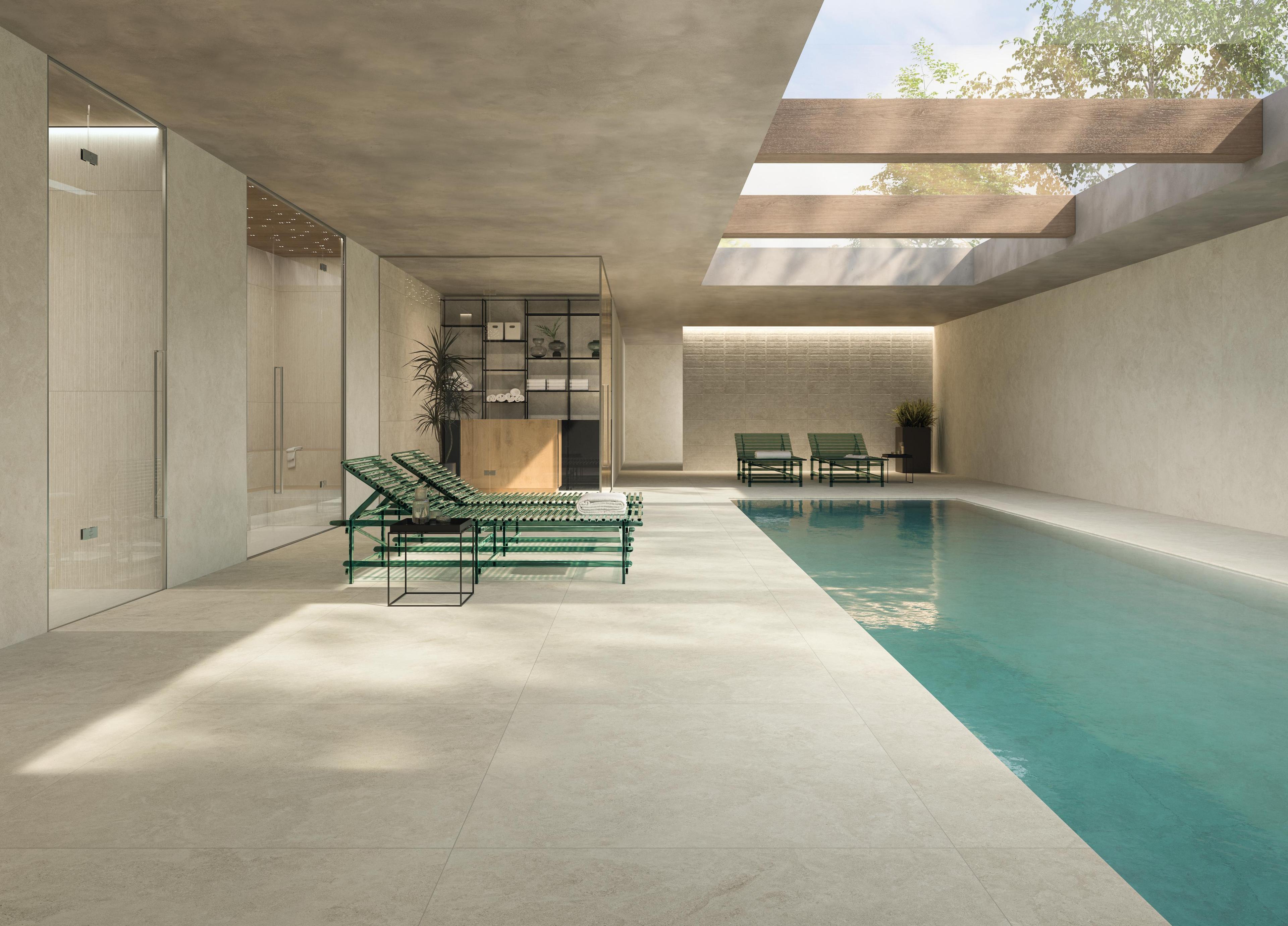
Textures for minimalist interiors must be perceptible without turning into autonomous decorative elements. Surfaces inspired by concrete, stone, raw earth or other natural materials can create sober yet articulated backdrops, introducing depth through controlled graphic, chromatic and tactile variations.

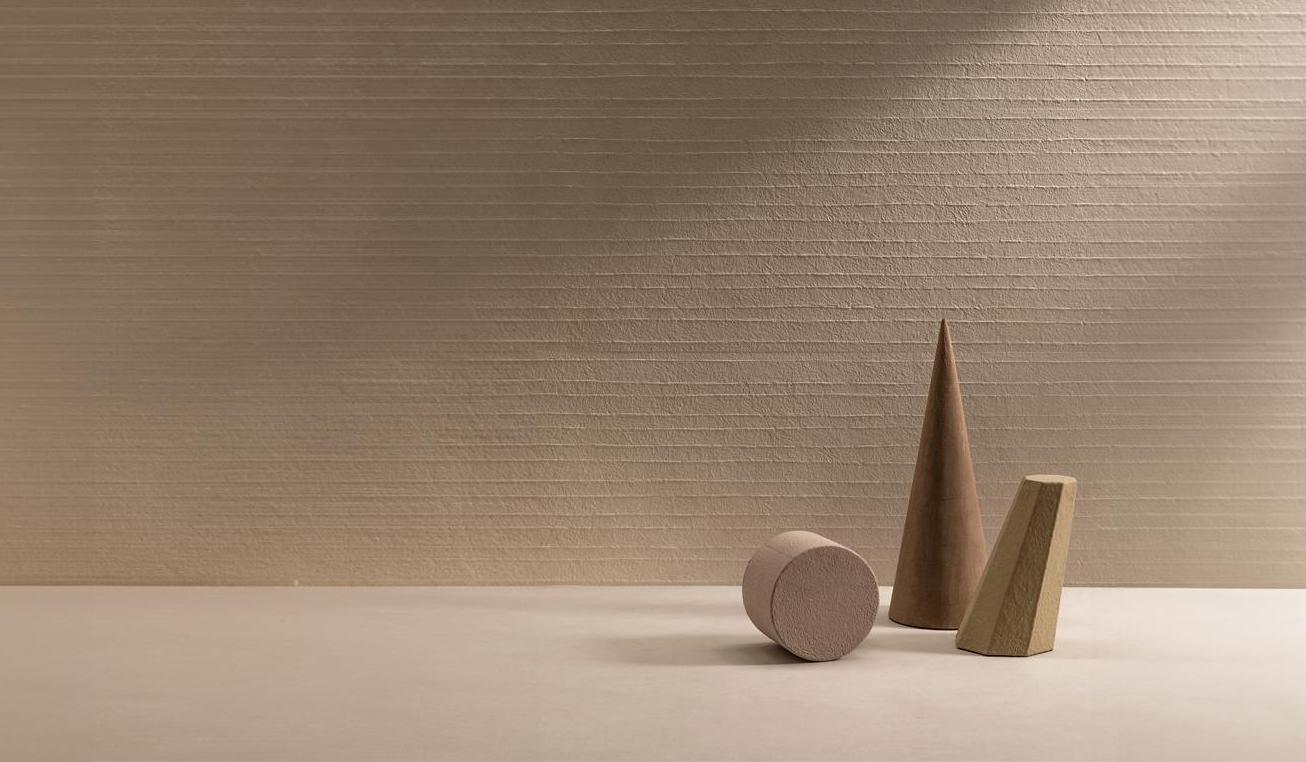
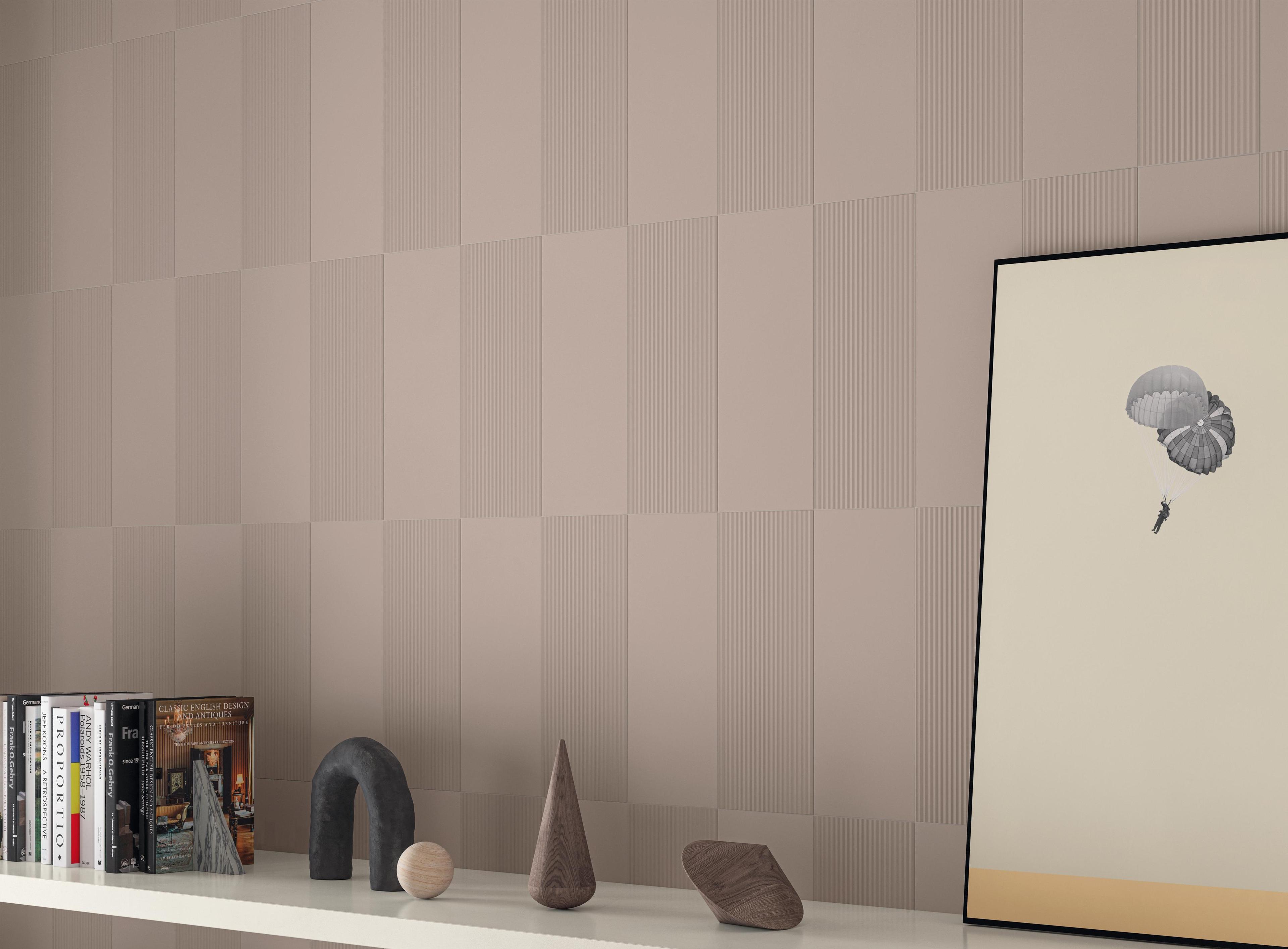
Finishes for minimalist interiors also affect the overall quality of the space. A matte surface returns a softer, more diffused light; a more pronounced texture generates shadows and perceptual variations; a relief can give character to a wall while keeping the palette restrained. The criterion is not to multiply effects, but to coordinate a few compatible surfaces, assigning each one a precise function within the composition and in its relationship with light.

Porcelain tile, large slabs and design continuity

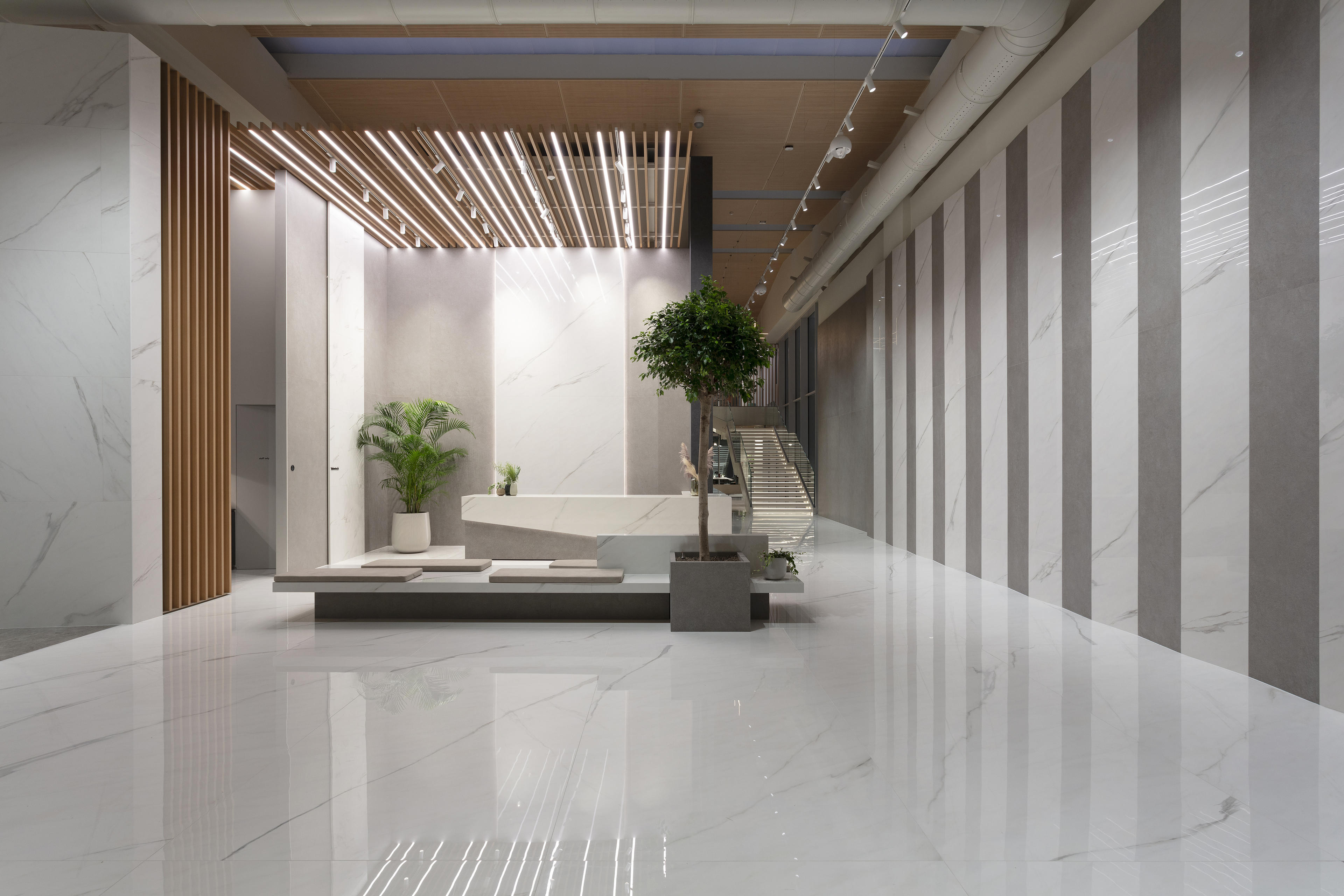
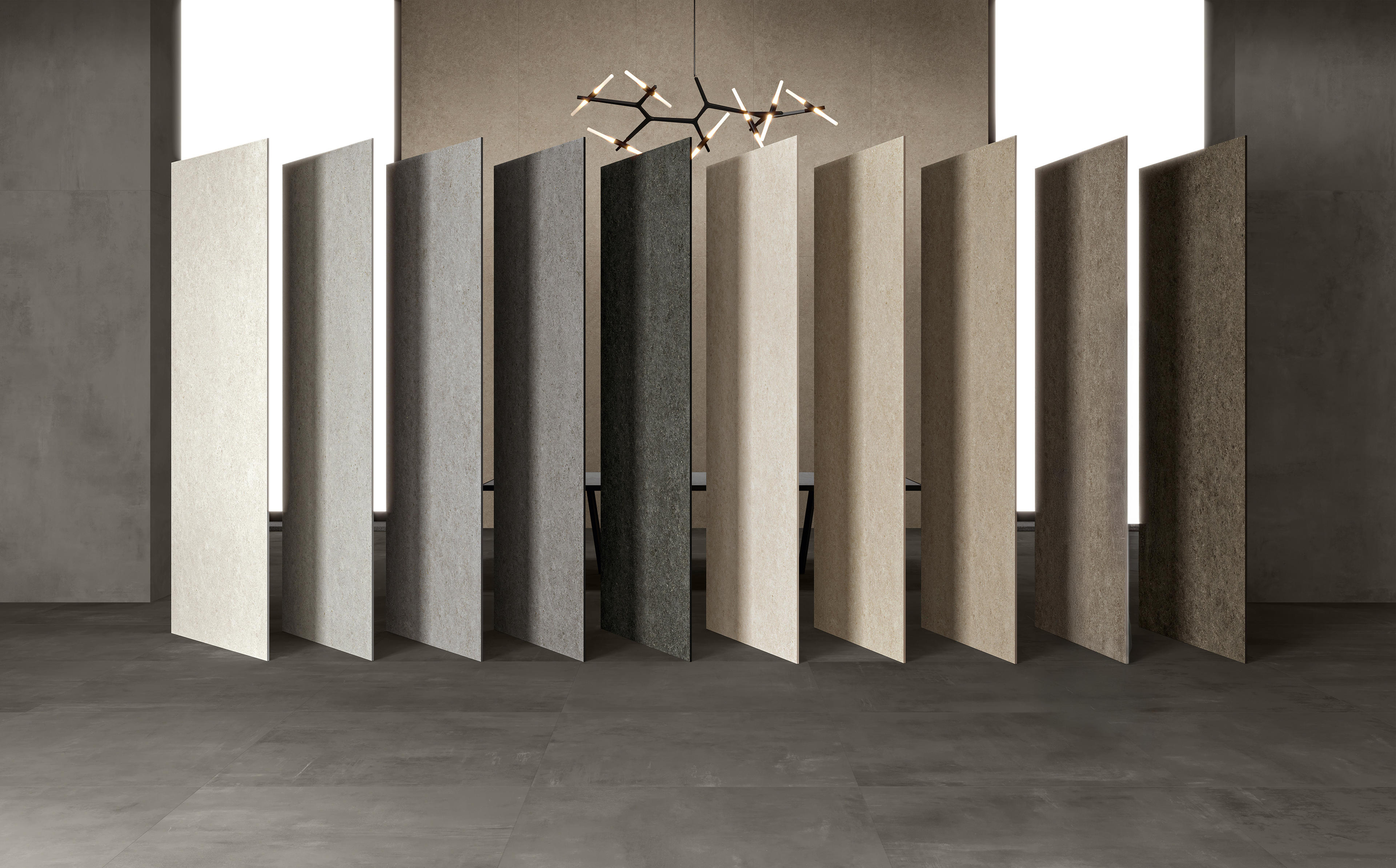
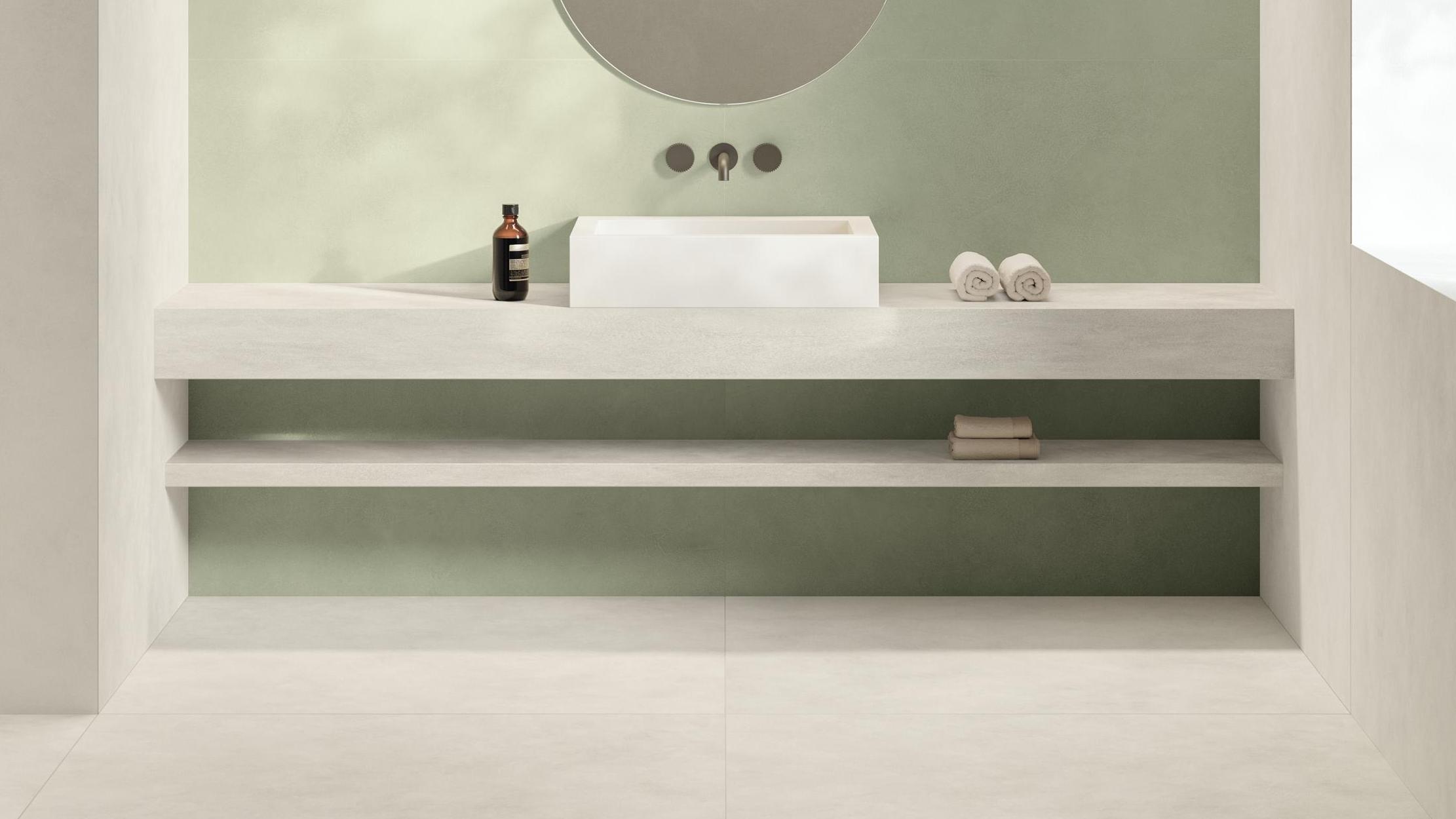
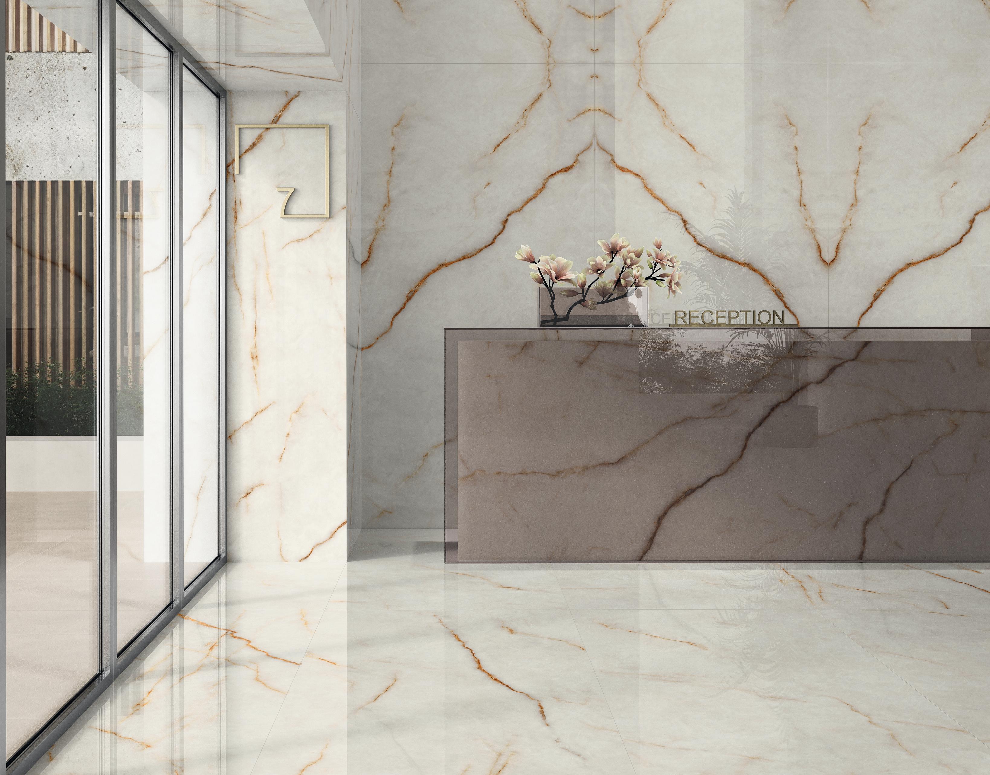
Minimalist porcelain tiles — beige porcelain tiles, grey porcelain tiles, warm neutral shades — do not identify a rigid category, but a way of using the material through measured colors, balanced graphics and controlled laying. Porcelain tiles with a concrete and resin effect, or with a stone or raw earth effect, make it possible to develop coordinated compositions, adapting formats and finishes to the different areas of the project.

Large slabs can expand the perception of the surface and reduce visual fragmentation. Continuity, however, also depends on alignments, cuts, thresholds, the color of the grout and the layout of the joints. These aspects must be assessed together with the format, especially in the transitions between spaces or between floor and wall tiles. Defining the laying patterns in advance also makes it possible to control junctions, visual axes and the distribution of the cuts.

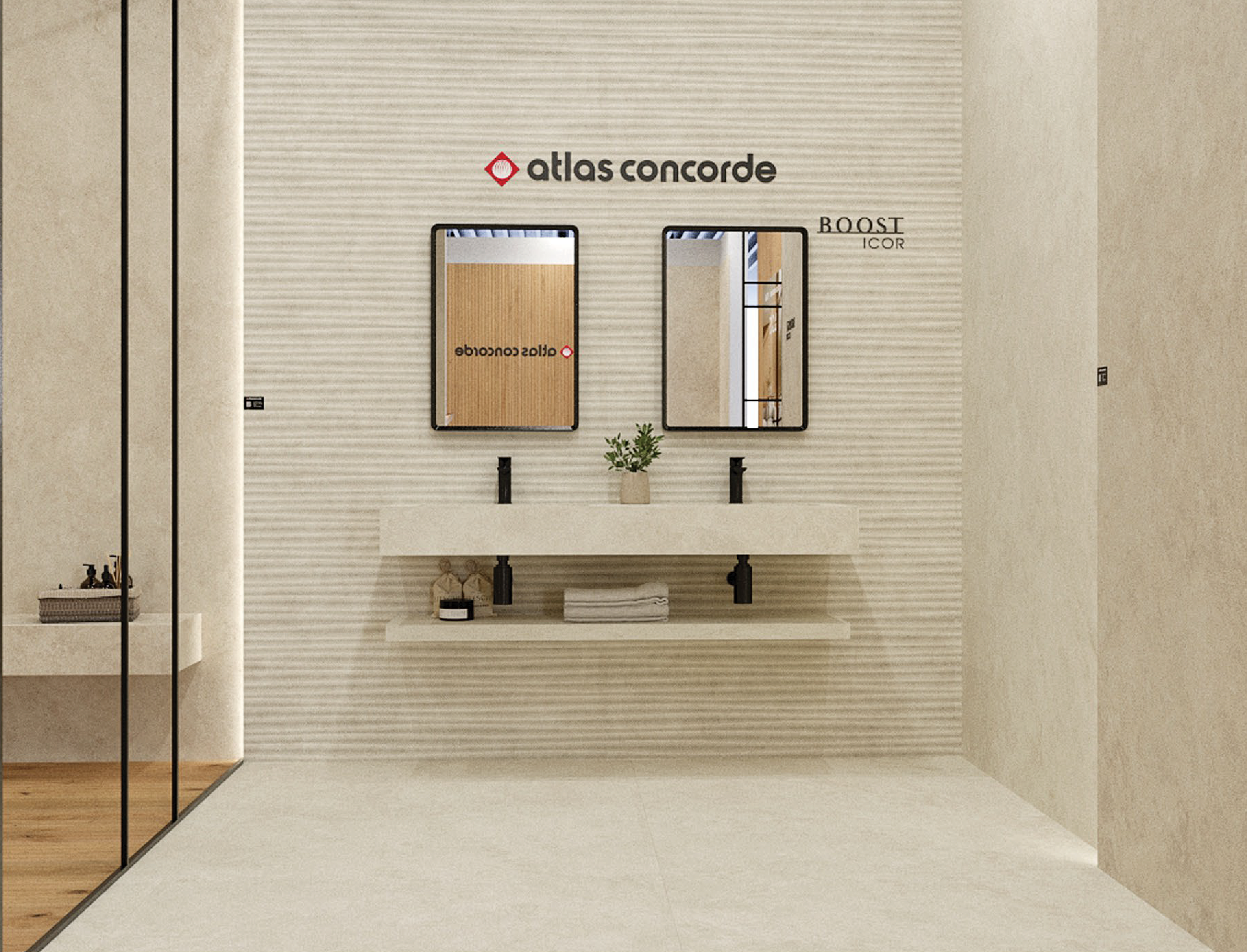
From this perspective, Boost World by Atlas Concorde brings together surfaces of different material inspiration yet similar in style and tone. The ability to combine collections, formats and finishes helps to build a coordinated proposal for residential, commercial and public spaces, while maintaining a shared language without resorting to the uniform repetition of the same effect.

Piastrelle grande formato Abitazione Effetto cemento Bianco
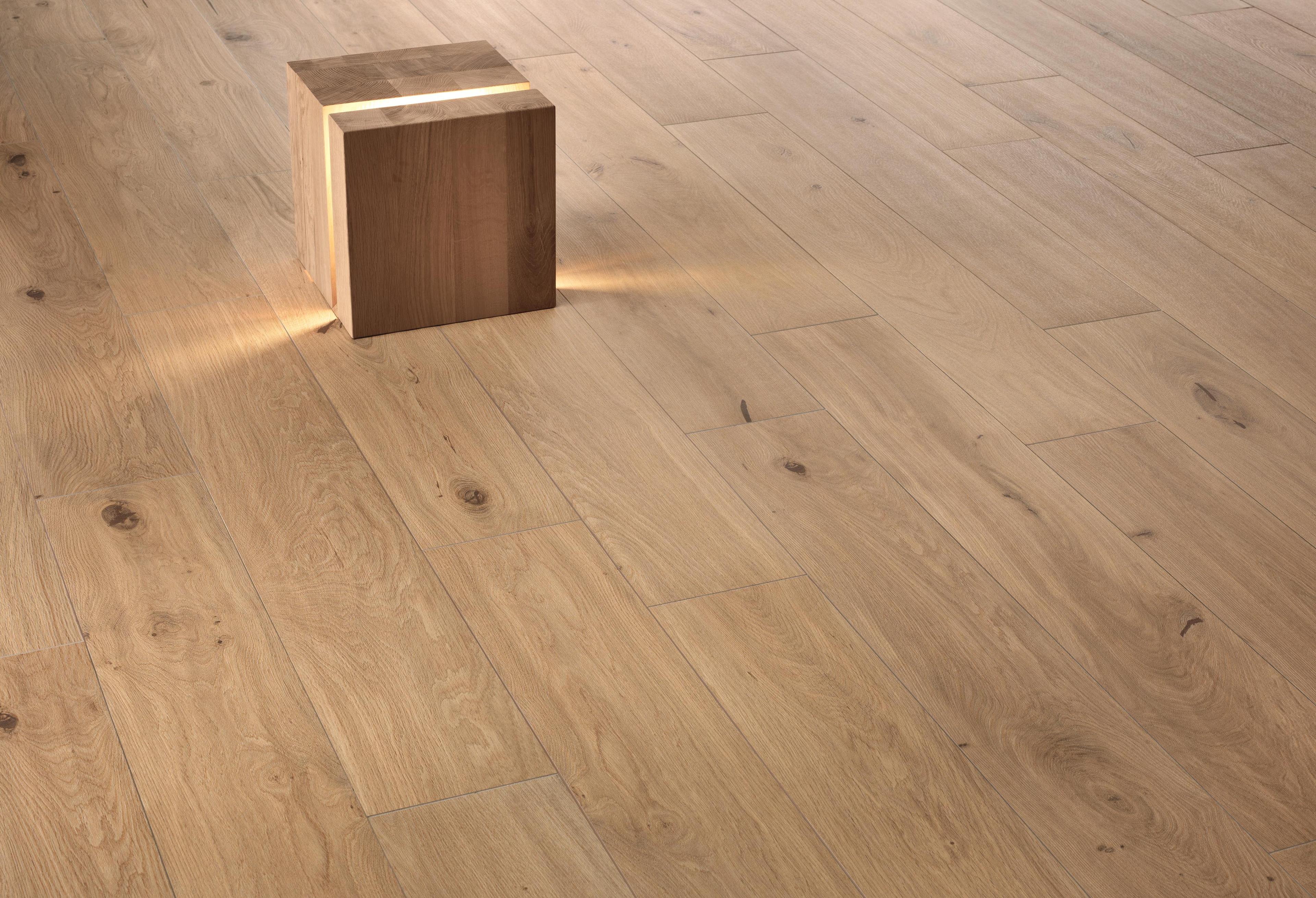
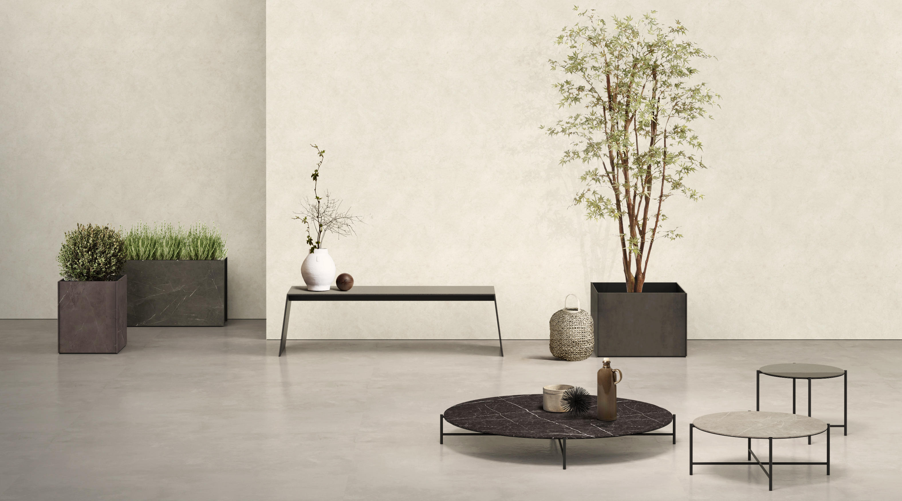
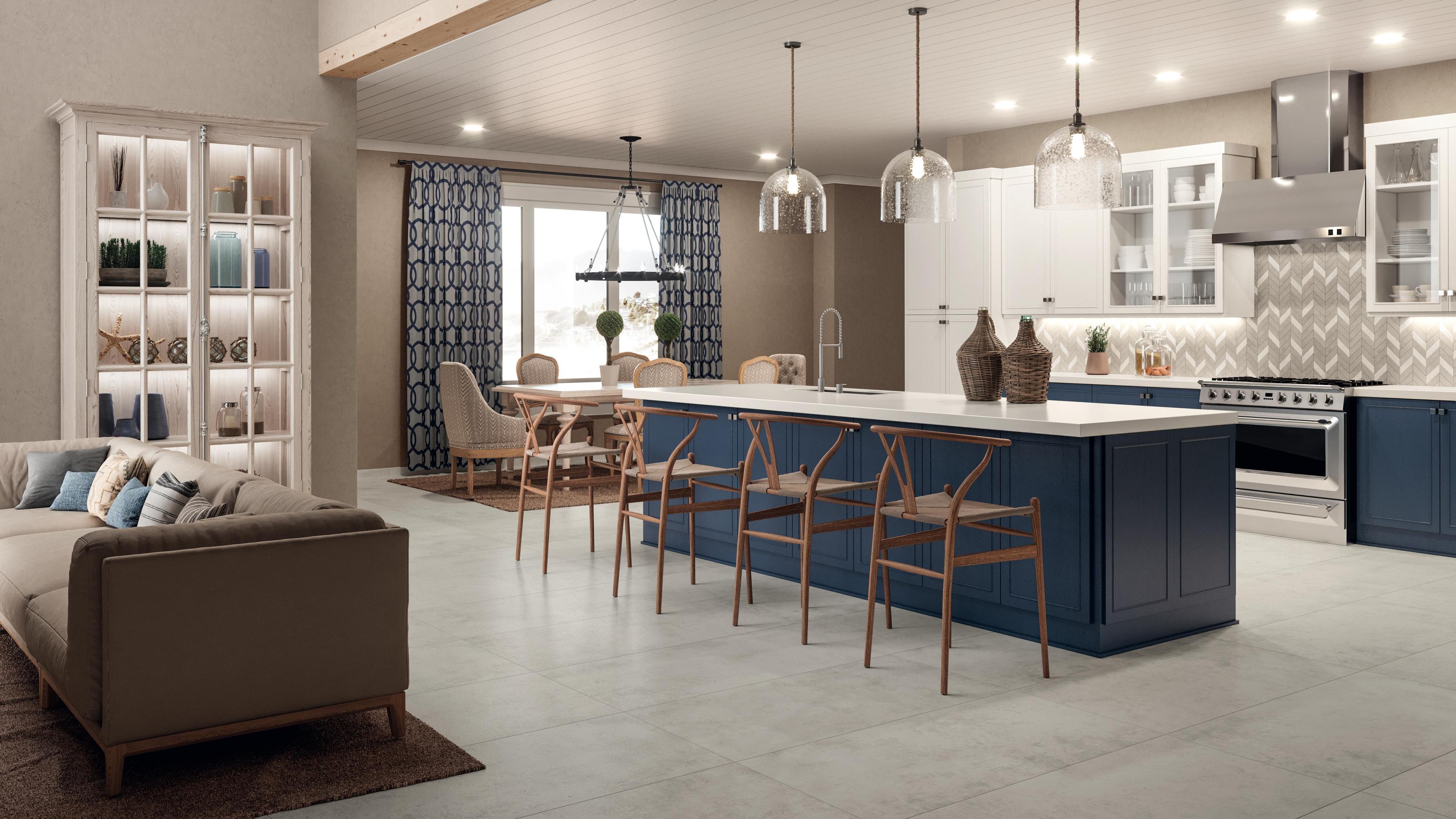
AtlasPlan_063_00_Boost Balance Ash

Light in the minimalist interior project

Light determines the depth, atmosphere and legibility of surfaces. In minimalist design, where every element is more exposed, natural and artificial lighting must be considered together with the choice of materials.

Grazing light enhances reliefs and textures, but it can also accentuate irregularities and joints; diffused light softens matte surfaces; warm or cool tones alter the perception of the palette. For this reason, samples should be observed at different times of the day and, where possible, under light sources similar to those planned for the project.

Artificial lighting can be organized on three complementary levels: general light for the legibility of the space, task light in working areas and accent light to highlight walls, niches or material details. A well-calibrated lighting hierarchy makes it possible to give character to a space without adding superfluous elements.

Designing coherent minimalist spaces

Coherence arises from recognizable relationships between materials, colors, furniture and light. It does not require every space to use the same surface, but rather that the variations belong to a shared design matrix.

It is useful to define a few main materials, a limited color range and clear criteria for junctions and transitions. In open-plan spaces, the continuity of the floor can unify the functions, while variations in texture, lighting or furniture distinguish the kitchen, living and dining areas. In the move from concept to specification, format, finish, intended use, level of foot traffic, the presence of water and maintenance requirements become central.

An effective selection must therefore hold together aesthetic result and design feasibility. Presenting notonlythe individual sample, but a combination of main surfaces, accents and laying details makes the project easier to understand and makes it possible to assess its overall consistency in advance.

Design applications: from residential to contract

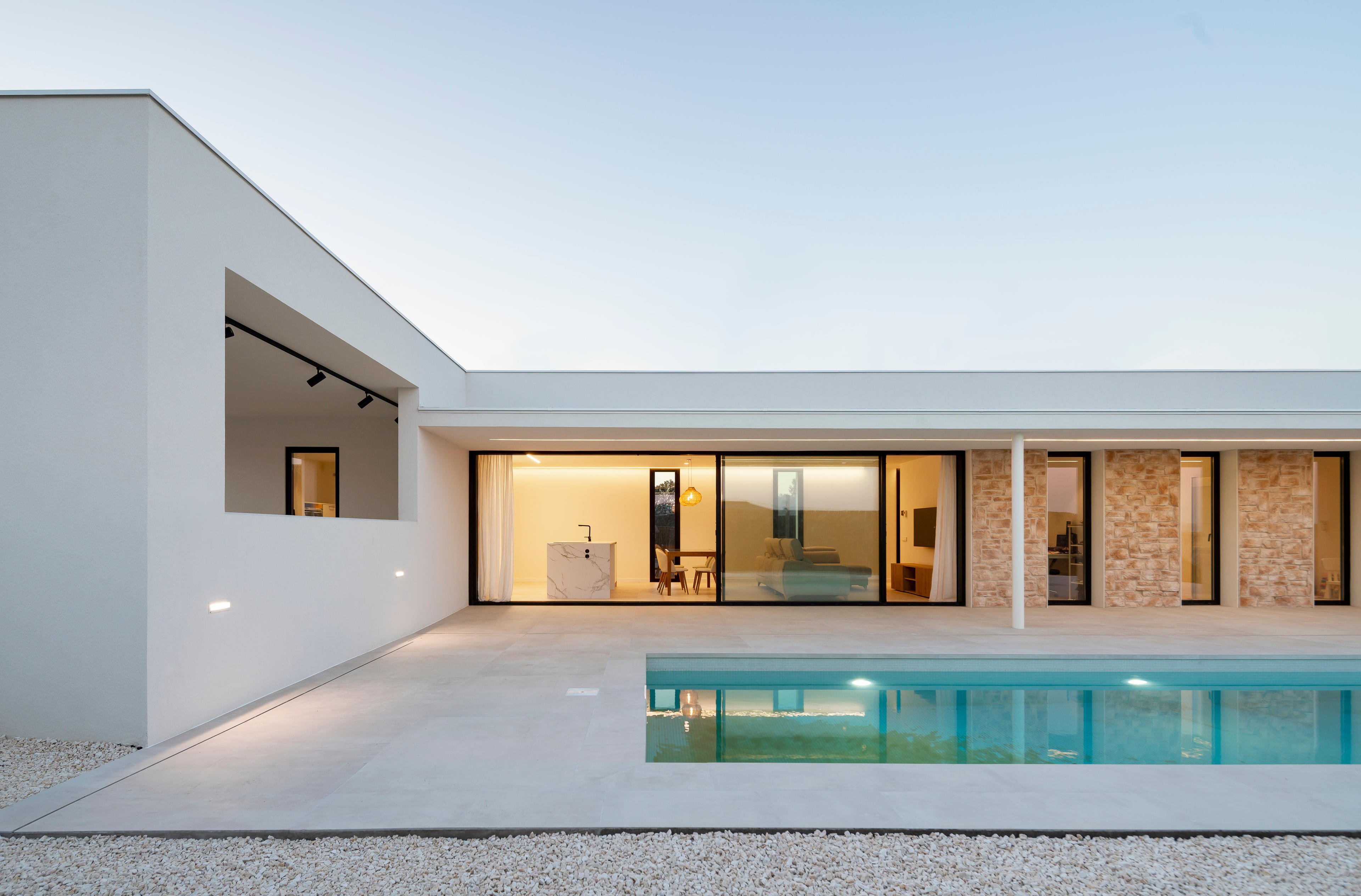
Contemporary minimalism can be applied to different contexts without requiring uniformity between spaces: the design method remains the same, while the requirements change in relation to durability, flows, maintenance, functions and the recognizability of the space. Coherence therefore arises from the ability to adapt palettes, surfaces and materials to the specific features of each project, while maintaining a shared language.

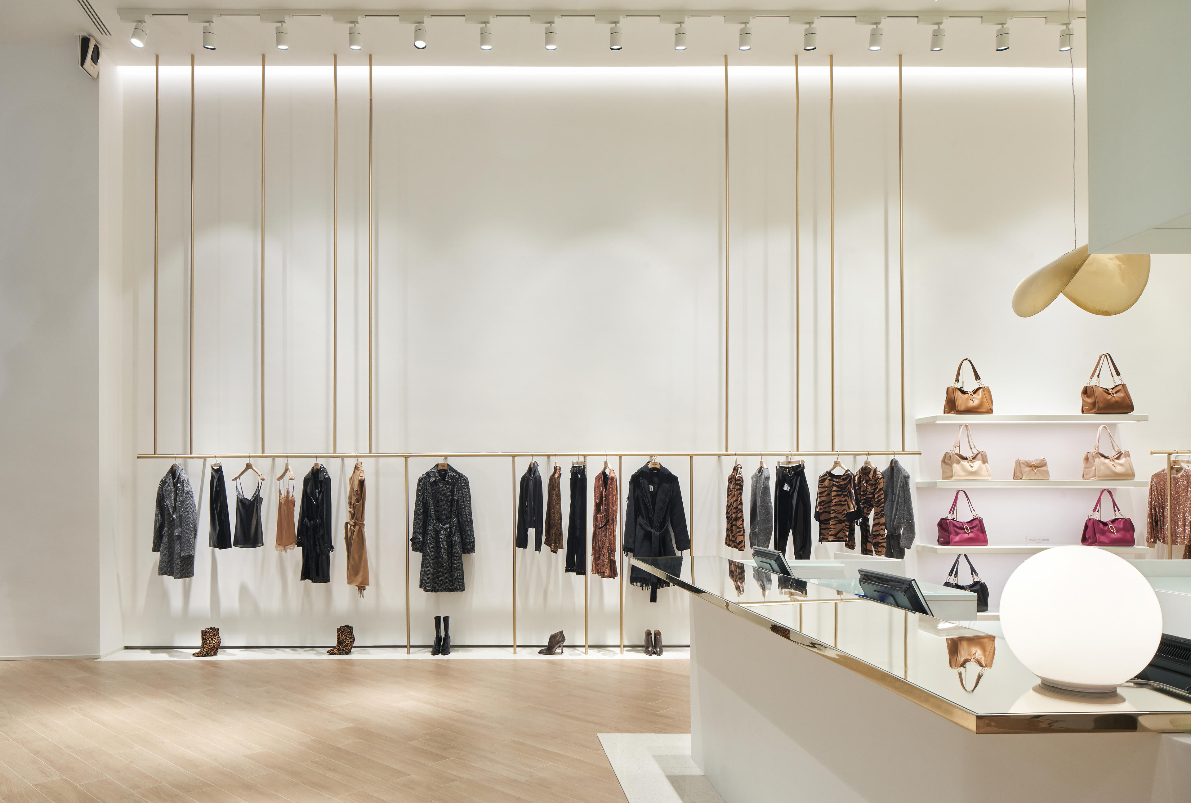
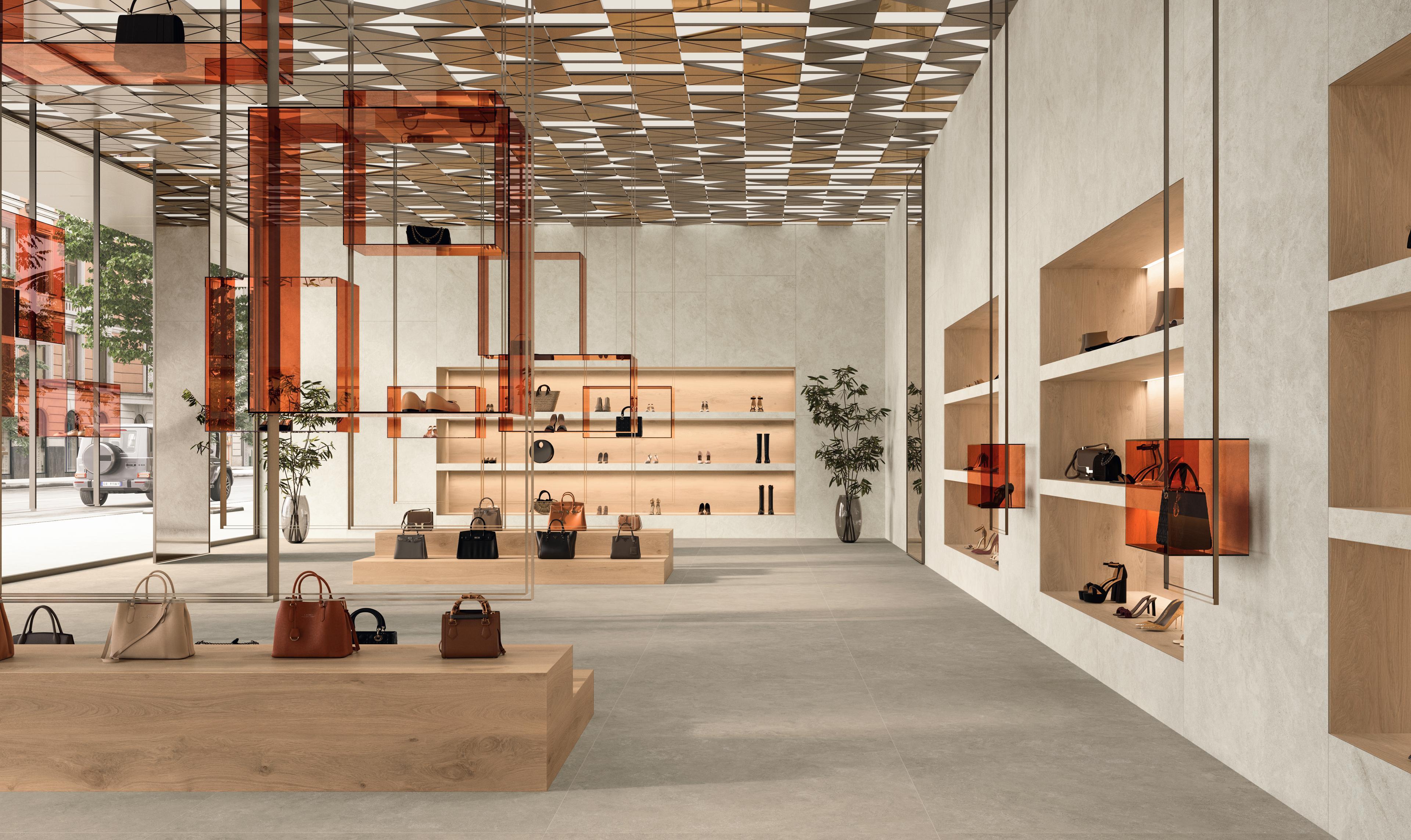
In homes and open-plan spaces, material continuity can connect the spaces, while controlled variations in effect, format or texture distinguish their different uses. In retail, hospitality and contract environments, the same criterion helps to make routes legible and to define areas with specific identities, without fragmenting the project.

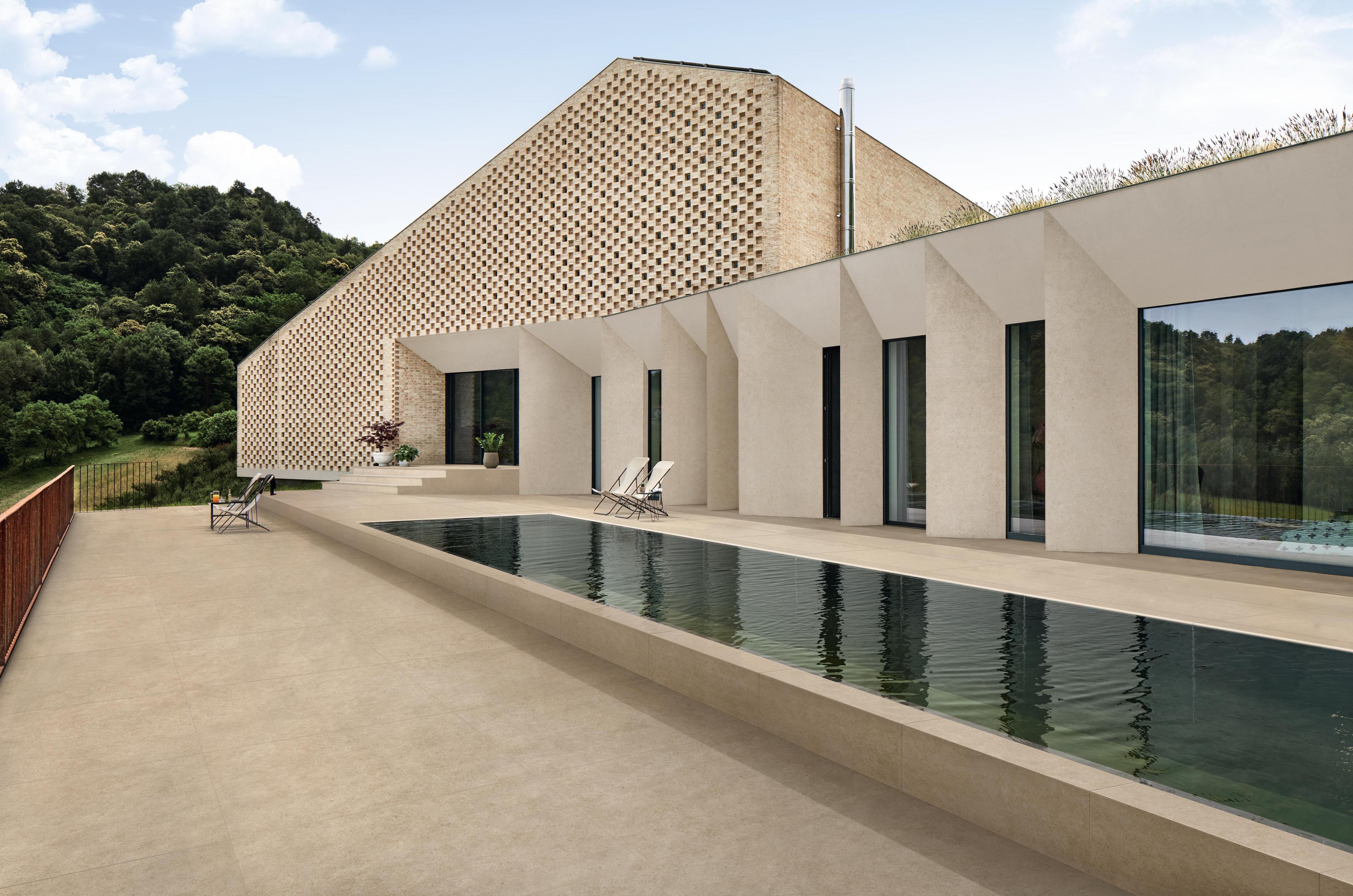
Villa Ladybug, in Bodrum, Turkey shows how essentiality can coexist with a sophisticated language. Large surfaces, soft tones and different interpretations of the stone effect build a harmonious whole, in which each space retains its own character within a shared vision. The project thus highlights a central principle of minimalist interior design: not the repetition of a single solution, but the conscious coordination of materials and finishes to achieve continuity, balance and recognizability.

The value of minimalist interior design therefore lies in the control of the whole. Colors, materials, surfaces and light become parts of a coherent system, capable of accompanying the project from the initial selection through to completion and of maintaining clarity, functionality and perceptual quality.

Contact Us

Please select one of the categories below